
论文
A high-quality genome compendium of the human gut microbiome of Inner Mongolians
2023Naturemicrobiology--Ahigh-qualitygenomecompendiumofthehumangutmicrobiomeofInnerMongolians4.pdf
论文中大部分作图数据都有,争取把论文中的图都复现一下
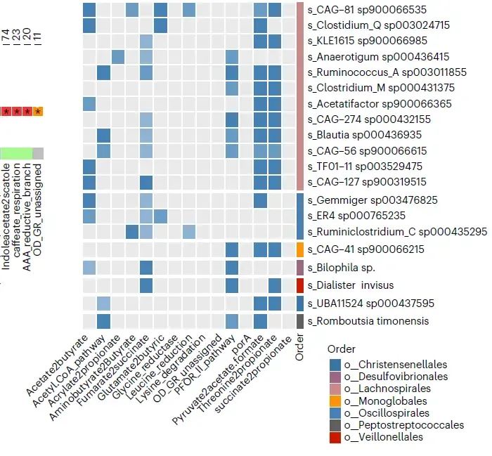
今天的推文我们试着复现一下论文中的Figure4C 下半部分的热图

部分示例数据截图

读取数据
library(readxl)
library(tidyverse)

fig4cb<-read_excel("D:/R_4_1_0_working_directory/env001/data/20230305/41564_2022_1270_MOESM7_ESM.xlsx",
                   sheet = "Fig 4c bottom",
                   col_types = "text")
fig4cb %>% dim()
fig4cb

colnames(fig4cb)[1]<-"y"
colnames(fig4cb)[-1]
fig4cb
宽格式转换为长格式数据
fig4cb %>%
  pivot_longer(!y,names_to = "x") %>%
  mutate(y=factor(y,levels = fig4cb %>% pull(y) %>% rev()),
         x=factor(x,levels = colnames(fig4cb)[-1])) -> new.fig4cb
构造右侧的颜色条数据
df<-data.frame(x=16,xend=16,
               y=c(0.6,1.6,2.6,3.6,4.6,5.6,8.6),
               yend=c(1.4,2.4,3.4,4.4,5.4,8.4,20.4),
               group=c("A","B","D","E","F","G","H"))
作图代码
p1<-ggplot(data = new.fig4cb,aes(x=x,y=y))+
  geom_tile(aes(fill=value),
            color="white",
            width=0.8,height=0.8)+
  theme_bw()+
  theme(panel.grid = element_blank(),
        panel.border = element_blank(),
        axis.ticks = element_blank(),
        axis.text.x = element_text(angle = 60,
                                   hjust=1,vjust = 1),
        legend.position = "bottom",
        legend.box = "vertical")+
  guides(color=guide_legend(nrow = 1,title.position = "top",
                            title.hjust = 0.5),
         fill=guide_legend(title.position = "top",
                           title.hjust = 0.5))+
  scale_fill_manual(values = c("0"="#eaeaea",
                               "1"="#8fb3d3",
                               "2"="#699bc3",
                               "3"="#4682b4"),
                    breaks = c("3","2","1","0"),
                    labels=c("100","50-90","0-50","0"),
                    name="The prevalence ofnSCFA MGC (%)")+
  coord_equal()+
  labs(x=NULL,y=NULL)+
  scale_y_discrete(position = "right")+
  geom_segment(data=df,
               aes(x=x,xend=xend,y=y,yend=yend,
                   color=group),
               size=5)+
  scale_color_manual(values = c("#606060","#3a75a7","#cb1a00",
                                "#9c6586","#ff9309","#4682b4",
                                "#ce8889"),
                     name="Order")

p1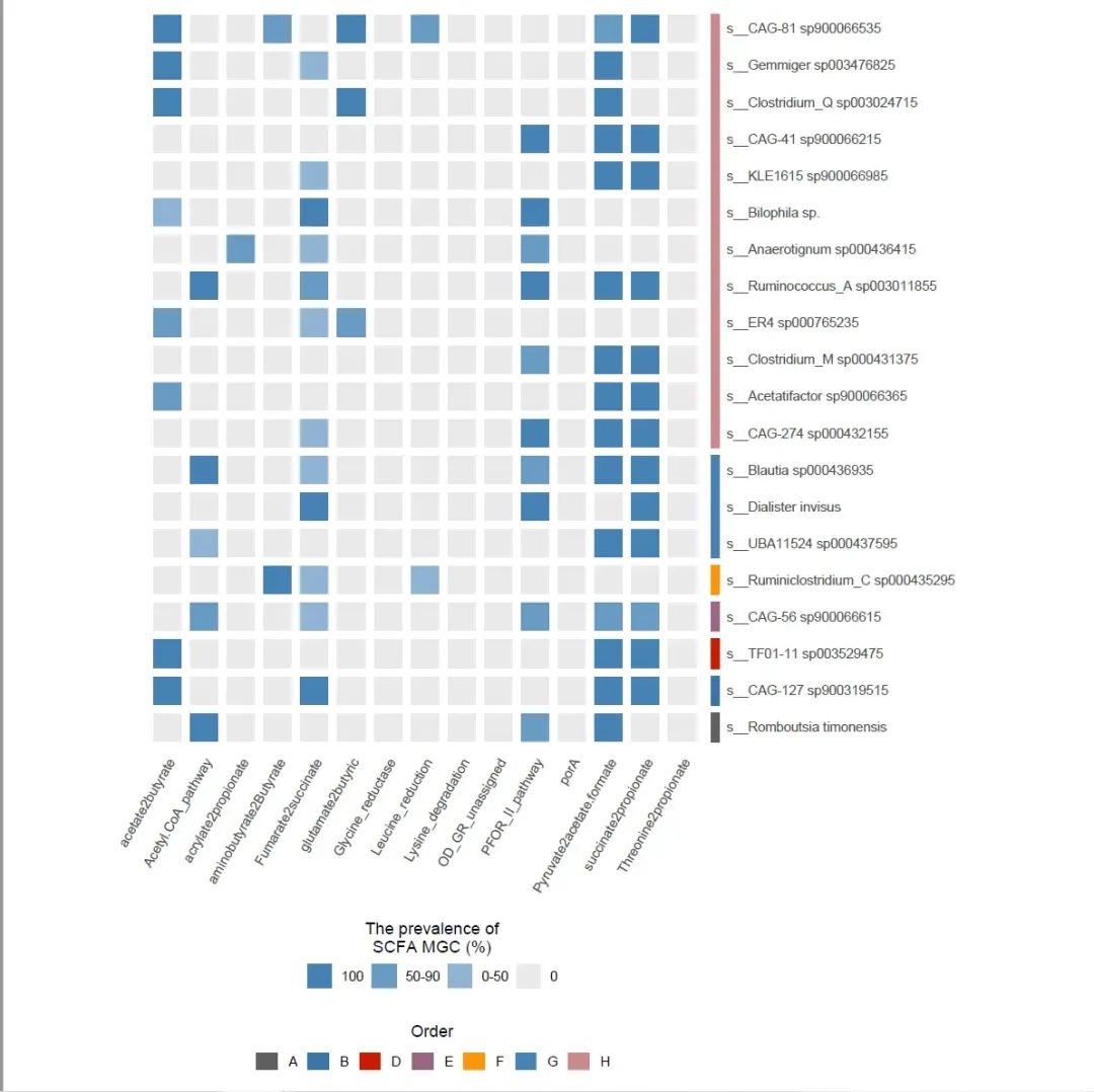
上侧的图思路也是一样的
代码
fig4ct<-read_excel("D:/R_4_1_0_working_directory/env001/data/20230305/41564_2022_1270_MOESM7_ESM.xlsx",
                   sheet = "Fig 4c top",
                   col_types = "text")
fig4ct %>% dim()
fig4ct

colnames(fig4ct)[1]<-"y"
colnames(fig4ct)[-1]
fig4ct

fig4ct %>%
  pivot_longer(!y,names_to = "x") %>%
  mutate(y=factor(y,levels = fig4ct %>% pull(y) %>% rev()),
         x=factor(x,levels = colnames(fig4ct)[-1])) -> new.fig4ct


p2<-ggplot(data = new.fig4ct,aes(x=x,y=y))+
  geom_tile(aes(fill=value),
            color="white",
            width=0.8,height=0.8,
            show.legend = FALSE)+
  theme_bw()+
  theme(panel.grid = element_blank(),
        panel.border = element_blank(),
        axis.ticks = element_blank(),
        axis.text.x = element_text(angle = 60,
                                   hjust=1,vjust = 1))+
  scale_fill_manual(values = c("0"="#eaeaea",
                               "1"="#8fb3d3",
                               "2"="#699bc3",
                               "3"="#4682b4"),
                    breaks = c("3","2","1","0"))+
  coord_equal()+
  labs(x=NULL,y=NULL)+
  scale_y_discrete(position = "right")

p2
把两个图拼到一起
library(patchwork)

p2+p1+
  plot_layout(guides = "collect")+
  plot_annotation(theme = theme(legend.position = "bottom",
                                legend.box = "vertical"))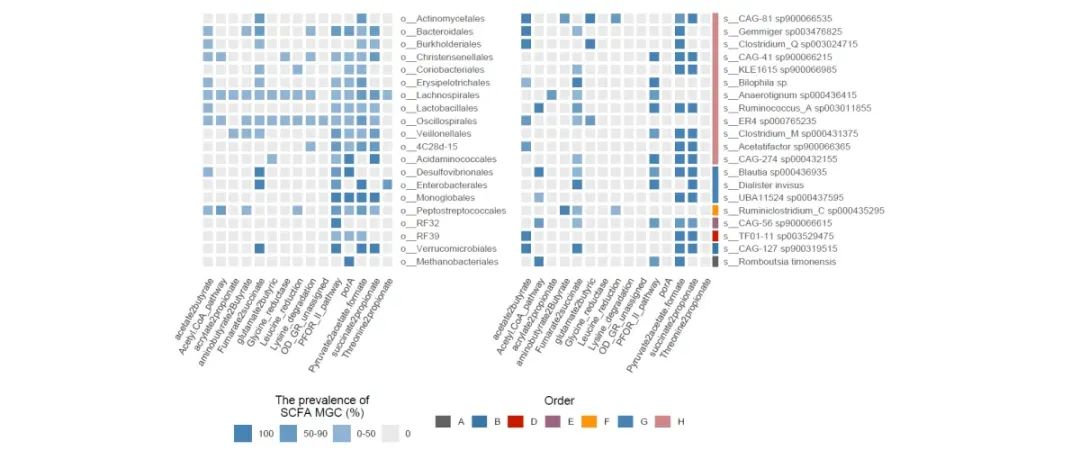
推文记录的是自己的学习笔记,很可能存在错误,请大家批判着看
示例数据和代码可以给推文打赏1元获取
声明:文中观点不代表本站立场。本文传送门:https://eyangzhen.com/193580.html