
前言
👏CSS实现平面圆点绕椭圆动画,速速来Get吧~🥇文末分享源代码。记得点赞+关注+收藏!
1.实现效果


2.实现原理
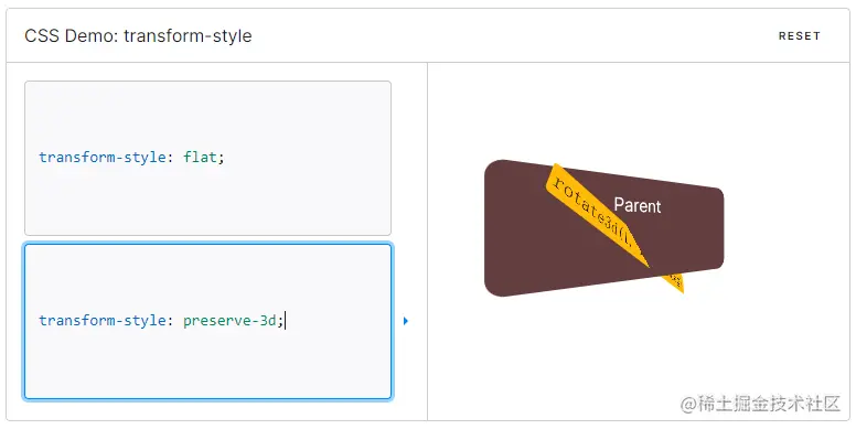
transform-style:[1]CSS 属性 transform-style 设置元素的子元素是位于 3D 空间中还是平面中。如果选择平面,元素的子元素将不会有 3D 的遮挡关系。
| 属性 | 含义 |
|---|---|
| flat | 设置元素的子元素位于该元素的平面中 |
| preserve-3d | 指示元素的子元素应位于 3D 空间中 |
eg:
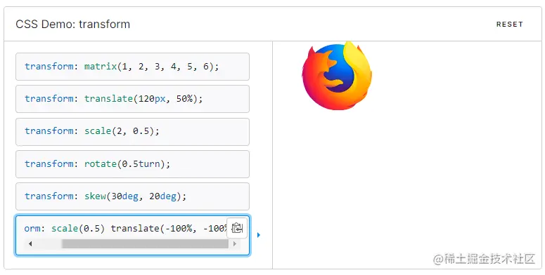
transform:[2]CSS transform 属性允许你旋转,缩放,倾斜或平移给定元素。这是通过修改 CSS 视觉格式化模型的坐标空间来实现的。transform属性可以指定为关键字值 none 或一个或多个值。
eg:
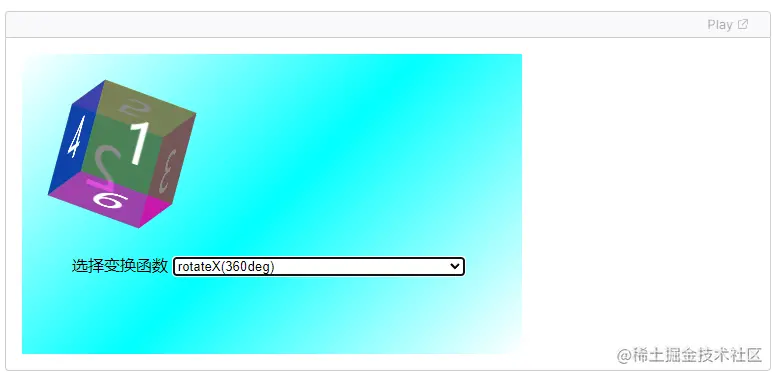
查看transform-function[3]
eg:
CSS 三角函数语法介绍:cos(): [4]CSS 函数 cos() 为三角函数,返回某数的余弦值,此值介于 -1 和 1 之间。此函数含有单个计算式,此式须将参数结果按弧度数解析为或,即 cos(45deg)、cos(0.125turn) 和 cos(3.14159 / 4) 均表示同一值,约为 0.707。
/* 单个 <angle> 值 */
width: calc(100px * cos(45deg));
width: calc(100px * cos(0.125turn));
width: calc(100px * cos(0.785398163rad));

/* 单个 <number> 值 */
width: calc(100px * cos(63.673));
width: calc(100px * cos(2 * 0.125));

/* 其他值 */
width: calc(100px * cos(pi));
width: calc(100px * cos(e / 2));
sin(): [5]CSS 函数 sin() 为三角函数,返回某数的正弦值,此值介于 -1 和 1 之间。此函数含有单个计算式,此式须将参数结果按弧度数解析为或,即 sin(45deg)、sin(0.125turn) 和 sin(3.14159 / 4) 均表示同一值,约为 0.707。CSS3 的这些函数使得开发者可以更加方便处理一些复杂的数学问题,增强了 CSS 的表现力。
/* 单个 <angle> 值 */
width: calc(100px * sin(45deg));
width: calc(100px * sin(0.25turn));
width: calc(100px * sin(1.0471967rad));

/* 单个 <number> 值 */
width: calc(100px * sin(63.673));
width: calc(100px * sin(2 * 0.125));

/* 其他值 */
width: calc(100px * sin(pi / 2));
width: calc(100px * sin(e / 4));巧妙利用三角函数关系,实现圆点在圆弧上的translate偏移[6]
x=a*cosr
y=b*sinr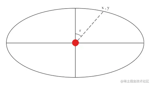
3.实现步骤
- 绘制父元素logo,设置宽高
<div class="logo"></div>.logo {
width: 450px;
height: 451px;
position: relative;
}- 为其添加伪元素,设置背景图片

.logo {
 &::after {
  content: "";
  width: 100%;
  height: 100%;
  background: url("@/assets/images/ani/logo.png") no-repeat;
  background-size: 100% 100%;
  position: absolute;
  left: 0;
  top: 0;
 }
}- 为背景图片添加上下浮动动画
&::after {
 animation: douce 2s infinite linear;
 @keyframes douce {
  0%,
   100% {
    transform: translateY(0);
   }
   50% {
    transform: translateY(-10px);
   }
 }
}- logo标签内绘制line线条
<div class="logo">
 <div class="line"></div>
</div>- 为line设置背景图片,是一个椭圆形状的渐变色线条,基于父元素水平垂直居中
- 可以发现线条和背景的透视不对

.line {
    width: 288px;
    height: 94px;
    left: calc(50% - 144px);
    bottom: 128px;
    border-radius: 50%;
    position: absolute;
    background: url("@/assets/images/ani/circle-round.png") no-repeat;
    background-size: 100% 100%;
}- 尝试去为父元素设置transform-style: preserve-3d,让子元素是位于 3D 空间中
.logo{
    transform-style: preserve-3d;
}- 为子元素line设置transform属性,稍微调整角度,透视关系正常

.line{
 transform: rotateZ(0deg) rotateX(1deg);
}- 为line添加伪元素,旋转的小圆点,基于line水平垂直居中

&::after {
 content: "";
 position: absolute;
 width: 11px;
 height: 11px;
 background: #5fffa5;
 border-radius: 50%;
 left:calc(50% - 5px);
 top:calc(50% - 5px);
}- 为圆点设置旋转动画,使用less简化代码

animation: move 10s linear infinite; .loop(@index,@a, @b, @s) when (@index < @s+1) {
// 椭圆x轴半径(长半径)@a
// 椭圆y轴半径(短半径)@b
// 坐标点的数目(数目越大,动画越精细)@s
.loop((@index + 1),@a, @b, @s);
@keyframeSel: @index * 100% / @s;
@{keyframeSel}{
transform: translate((@a * cos(360deg / @s*@index)),(@b * sin(360deg / @s*@index)));
}
}@keyframes move {
.loop(0,144px,42px,40);
}3.实现代码
<div class="logo">
<div class="line"></div>
</div>body{
background: linear-gradient(90deg, #03224e 0%, #011030 100%);
display:flex;
align-items:center;
justify-content: center;
height:100vh;
}
.logo {
width: 450px;
height: 451px;
transform-style: preserve-3d;
position: relative;
&::after {
content: "";
width: 100%;
height: 100%;
background: url("https://i.postimg.cc/Sxn1cPT8/logo.png") no-repeat;
background-size: 100% 100%;
position: absolute;
left: 0;
top: 0;
animation: douce 2s infinite linear;
@keyframes douce {
0%,
100% {
transform: translateY(0);
}
50% {
transform: translateY(-10px);
}
}
}
}
.line {
width: 288px;
height: 93px;
left: calc(50% - 144px);
bottom: 128px;
border-radius: 50%;
position: absolute;
background: url("https://i.postimg.cc/DyZxKDKD/circle-round.png") no-repeat;
background-size: 100% 100%;
transform-style: preserve-3d;
transform: rotateZ(0deg) rotateX(1deg);
&::after {
content: "";
position: absolute;
width: 11px;
height: 11px;
background: #5fffa5;
border-radius: 50%;
transform-style: preserve-3d;
top: 0;
left: 0;
right: 0;
bottom: 0;
margin: auto;
animation: move 10s linear infinite;
}
@keyframes move {
.loop(0,144px,42px,40);
}
}
  .loop(@index,@a, @b, @s) when (@index < @s+1) {
    // 椭圆x轴半径(长半径)@a
    // 椭圆y轴半径(短半径)@b
    // 坐标点的数目(数目越大,动画越精细)@s
    .loop((@index + 1),@a, @b, @s);
    @keyframeSel: @index * 100% / @s;
    @{keyframeSel}{
      transform: translate((@a * cos(360deg / @s*@index)),(@b * sin(360deg / @s*@index)));
    }
}4.写在最后🍒
看完本文如果觉得对你有一丢丢帮助,记得点赞+关注+收藏鸭 🍕
更多相关内容,关注🍥苏苏的bug,🍡苏苏的github,🍪苏苏的码云~
参考资料
[1]transform-style:: https://developer.mozilla.org/zh-CN/docs/Web/CSS/transform-style
[2]transform:: https://developer.mozilla.org/zh-CN/docs/Web/CSS/transform
[3]查看链接: https://developer.mozilla.org/zh-CN/docs/Web/CSS/transform-function
[4]cos():: https://developer.mozilla.org/zh-CN/docs/Web/CSS/cos
[5]sin():: https://developer.mozilla.org/zh-CN/docs/Web/CSS/sin
[6]巧妙利用三角函数关系,实现圆点在圆弧上的translate偏移:: https://yddmgirl.github.io/2017/08/09/animation%E6%B2%BF%E6%A4%AD%E5%9C%86%E8%BD%A8%E9%81%93%E8%BF%90%E5%8A%A8/
声明:文中观点不代表本站立场。本文传送门:https://eyangzhen.com/306629.html