
1引言
网上看到一个基因聚类的热图,对不同组的基因进行分面展示,觉得可以用 ClusterGVis 来试试。提取一下聚类的数据,加个分组,然后画个折线图,再拼一个富集图就行了。
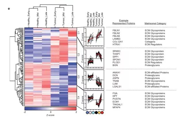
参考图:

2测试
library(ClusterGVis)
library(tidyverse)
library(ggplot2)
library(org.Mm.eg.db)

# load data
data(exps)

# using mfuzz for clustering
# mfuzz
cm <- clusterData(exp = exps,
                  cluster.method = "mfuzz",
                  cluster.num = 6)

# enrich for clusters
enrich <- enrichCluster(object = cm,
                        OrgDb = org.Mm.eg.db,
                        type = "BP",
                        organism = "mmu",
                        pvalueCutoff = 0.5,
                        topn = 5,
                        seed = 5201314)
提取数据,加个分组:
# add group
df_long <- cm$long.res |>
  mutate(group = case_when(cell_type %in% c("zygote","t2.cell") ~ "time 1",
                           cell_type %in% c("t4.cell","t8.cell") ~ "time 2",
                           cell_type %in% c("tmorula","blastocyst") ~ "time 3"))
然后循环绘制折线图和富集条形图:
# loop plot
palette = c("Light Grays","Blues3","Purples2","Purples3","Reds3","Greens2")
lapply(1:6, function(x){
  tmp <- df_long |> filter(cluster == x)

  # plot
  p <-
  ggplot2::ggplot(tmp,ggplot2::aes(x = cell_type,y = norm_value)) +
    ggplot2::geom_line(ggplot2::aes(group = gene),color = "grey90",linewidth = 0.5) +
    ggplot2::geom_line(stat = "summary", fun = "median", colour = "#C70039", linewidth = 1,
                       ggplot2::aes(group = 1)) +
    ggplot2::theme_classic(base_size = 12) +
    ggplot2::ylab('Normalized expression') + ggplot2::xlab('') +
    ggplot2::theme(axis.ticks.length = ggplot2::unit(0.1,'cm'),
                   strip.background = ggplot2::element_rect(color = "white"),
                   axis.text.x = element_text(angle = 45,hjust = 1),
                   strip.text = ggplot2::element_text(face = "bold.italic"),
                   panel.spacing.x = unit(0,"mm")) +
    # ggplot2::facet_wrap(~group,ncol = 3,scales = 'free_x') +
    ggh4x::facet_wrap2(~group,ncol = 3,scales = 'free_x',
                       strip = ggh4x::strip_themed(
                         background_x = ggh4x::elem_list_rect(fill = c("#FDE5EC", "#FCBAAD","#E48586"))
                       )) +
    ggplot2::scale_x_discrete(expand = c(0.05,0.05))


  # ============================================================================
  tmp1 <- enrich |> dplyr::filter(group == unique(enrich$group)[x]) |>
    dplyr::arrange(desc(pvalue))

  tmp1$Description <- factor(tmp1$Description,levels = tmp1$Description)

  # plot
  pgo <-
    ggplot(tmp1) +
    geom_col(aes(x = -log10(pvalue),y = Description,fill = -log10(pvalue)),
             width = 0.75) +
    geom_point(aes(x = ratio,y = Description),size = 3,color = "orange") +
    theme_bw() +
    scale_y_discrete(position = "right",
                     labels = function(x) stringr::str_wrap(x, width = 40)) +
    scale_x_continuous(sec.axis = sec_axis(~.,name = "log10(Ratio)")) +
    colorspace::scale_fill_binned_sequential(palette = palette[x]) +
    ylab("")

  pmer <- cowplot::plot_grid(plotlist = list(p,pgo))

  return(pmer)
}) -> line_list

# assign names
names(line_list) <- paste("C",1:6,sep = "")
最后就是绘图了:
pdf('facet_line.pdf',height = 16,width = 16)
visCluster(object = cm,
           plot.type = "both",
           column_names_rot = 45,
           add.box = T,
           add.line = F,
           boxcol = ggsci::pal_npg()(6),
           line.side = "left",
           sample.group = rep(c("group1","group2","group3"),each = 2),
           cluster.order = c(1:6),
           gglist = line_list,
           ggplot.panel.arg = c(6,0.1,26,"grey90",NA))
dev.off()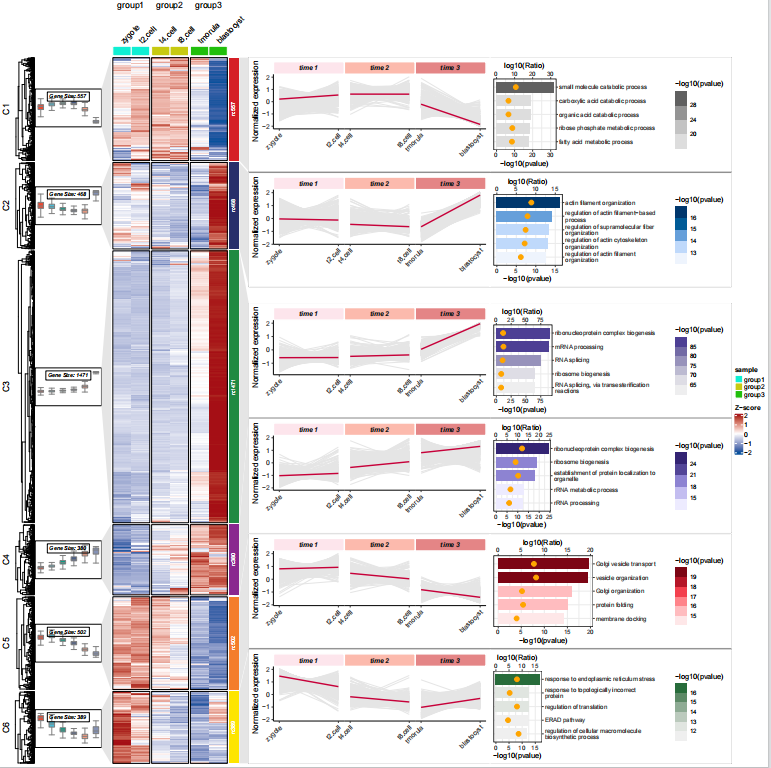
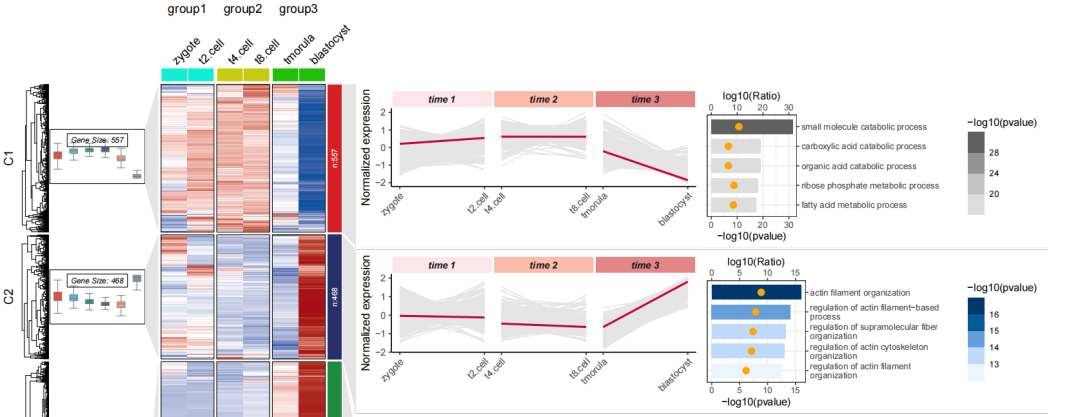
放大一点看看:
3结尾
路漫漫其修远兮,吾将上下而求索。
欢迎加入生信交流群。加我微信我也拉你进 微信群聊 老俊俊生信交流群 (微信交流群需收取 20 元入群费用,一旦交费,拒不退还!(防止骗子和便于管理)) 。QQ 群可免费加入, 记得进群按格式修改备注哦。
声明:文中观点不代表本站立场。本文传送门:https://eyangzhen.com/314187.html