
1引言
群友们在群里发了一张单细胞的密度散点图,并引起了群友们的一些讨论,看着有点炫酷,乘此机会总结和简单复现一下。
文章:


细胞密度图:
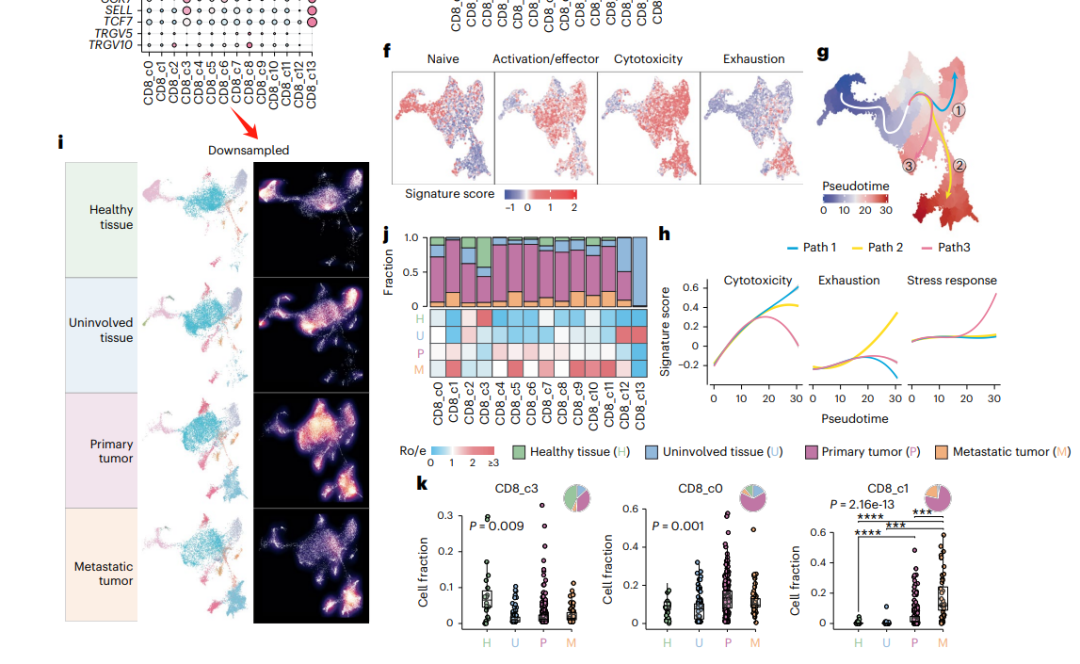
图注:
左边就是正常的分组后的不同亚群的散点图,右边则是每个亚群的细胞密度图,颜色越亮点密度越大。
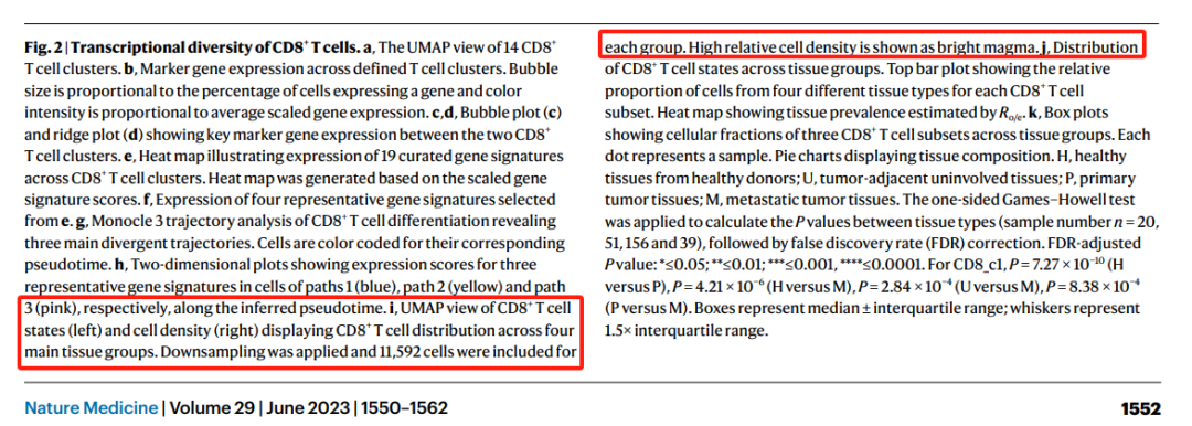
2基因表达密度图
我们先看看基因表达的散点密度图。
类似于等高线:
library(ggplot2)
library(ggSCvis)
library(dplyr)
library(grid)


genes <- c("LYZ", "GNLY", "CD3E")

ggscplot(object = pbmc,features = genes) +
  geom_density2d(bins = 8,show.legend = F,color = "grey50") +
  geom_scPoint(aes(color = value)) +
  scale_color_gradient(low = "white",high = "#CC0033",name = "gene expression") +
  facet_wrap(~gene_name,ncol = 3) +
  theme_bw() +
  theme(panel.grid = element_blank(),
        axis.ticks = element_blank(),
        strip.background = element_blank(),
        strip.text = element_text(face = "bold.italic",size = rel(1)),
        axis.text = element_blank())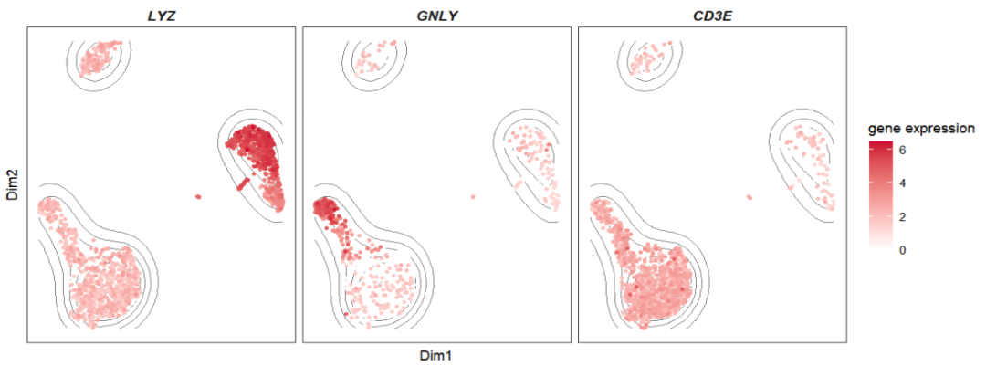
填充颜色:
ggscplot(object = pbmc,features = genes) +
  geom_density2d_filled(bins = 10,show.legend = F) +
  geom_scPoint(aes(color = value),size = 0.2) +
  scale_color_gradient(low = "white",high = "#CC0033",name = "gene expression") +
  facet_wrap(~gene_name,ncol = 3) +
  theme_bw() +
  theme(panel.grid = element_blank(),
        axis.ticks = element_blank(),
        strip.background = element_blank(),
        strip.text = element_text(face = "bold.italic",size = rel(1)),
        axis.text = element_blank()) +
  scale_fill_manual(values = colorRampPalette(c("white","#336633"))(10))
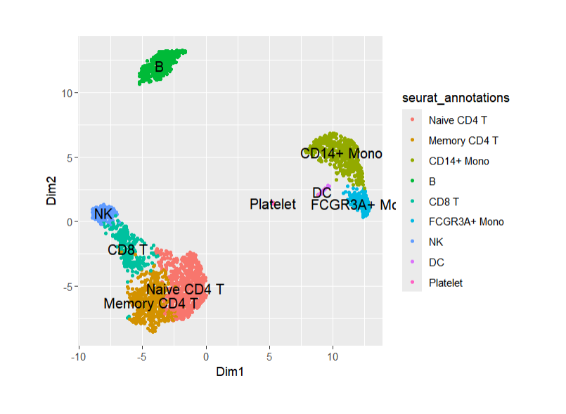
你也可以突出某些特定亚群,先找到对应位置是哪些细胞:ggscplot(object = pbmc) +
geom_scPoint(aes(color = seurat_annotations,cluster = seurat_annotations))
画图:
ggscplot(object = pbmc,features = genes) +
  geom_scPoint(color = "grey80") +
  geom_density2d_filled(data = . %>%
                          filter(seurat_annotations %in% c("CD14+ Mono","NK","Naive CD4 T")),
                        bins = 6,show.legend = F,alpha = 0.5) +
  scale_fill_manual(values = colorRampPalette(c("white","#336633"))(6)) +
  geom_scPoint(data = . %>%
                 filter(seurat_annotations %in% c("CD14+ Mono","NK","Naive CD4 T")),
               aes(color = value)) +
  scale_color_gradient(low = "white",high = "#CC0033",name = "gene expression") +
  facet_wrap(~gene_name,ncol = 3) +
  theme_bw() +
  theme(panel.grid = element_blank(),
        axis.ticks = element_blank(),
        strip.background = element_blank(),
        strip.text = element_text(face = "bold.italic",size = rel(1)),
        axis.text = element_blank())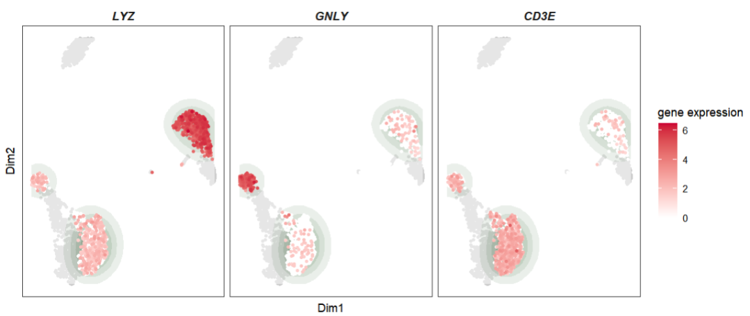
或者我们将细胞密度和基因表达结合起来展示:
ggscplot(object = pbmc,features = genes) +
  stat_density2d(geom = "raster",aes(fill = ..density..),
                 contour = F) +
  geom_scPoint(aes(color = value),size = 0.2) +
  scale_color_gradient(low = "white",high = "black",name = "gene expression") +
  facet_wrap(~gene_name,ncol = 3) +
  theme_bw() +
  theme(panel.grid = element_blank(),
        axis.ticks = element_blank(),
        strip.background = element_blank(),
        strip.text = element_text(face = "bold.italic",size = rel(1)),
        axis.text = element_blank()) +
  scale_fill_viridis_c(option = "rocket",direction = -1,name = "cell density") +
  coord_cartesian(expand = F)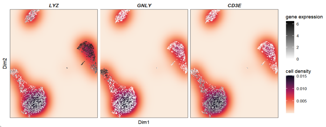
颜色反转更酷炫,更直观:
ggscplot(object = pbmc,features = genes) +
  stat_density2d(geom = "raster",aes(fill = ..density..),
                 contour = F) +
  geom_scPoint(aes(color = value),size = 0.2) +
  scale_color_gradient(low = "black",high = "white",name = "gene expression") +
  facet_wrap(~gene_name,ncol = 3) +
  theme_bw() +
  theme(panel.grid = element_blank(),
        axis.ticks = element_blank(),
        strip.background = element_blank(),
        strip.text = element_text(face = "bold.italic",size = rel(1)),
        axis.text = element_blank()) +
  scale_fill_viridis_c(option = "rocket",direction = 1,name = "cell density") +
  coord_cartesian(expand = F)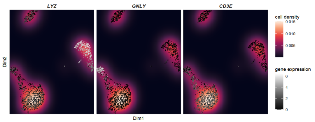
3亚群分类密度图
和上面一样的道理,我们现在只需要只绘制密度图层即可,然后和原始亚群散点图拼个图就行:
pbmc$group <- sample(LETTERS[1:3],2638,replace = T)

p1 <-
  ggscplot(object = pbmc) +
  stat_density2d(geom = "raster",aes(fill = ..density..),
                 contour = F,show.legend = F) +
  geom_scPoint(color = "white",size = 0.2) +
  facet_wrap(~group,ncol = 3) +
  theme_bw() +
  theme(panel.grid = element_blank(),
        axis.ticks = element_blank(),
        strip.background = element_blank(),
        strip.text = element_blank(),
        axis.text = element_blank()) +
  scale_fill_viridis_c(option = "magma",direction = 1) +
  coord_cartesian(expand = F)

p2 <-
  ggscplot(object = pbmc) +
  geom_scPoint(aes(color = seurat_annotations,
                   cluster = seurat_annotations),
               show.legend = F,
               label.gp = gpar(fontsize = 8,fontface = "bold.italic")) +
  facet_wrap(~group,ncol = 3) +
  theme_bw() +
  theme(panel.grid = element_blank(),
        axis.ticks = element_blank(),
        strip.background = element_blank(),
        strip.text = element_text(face = "bold.italic",size = rel(1)),
        axis.text = element_blank()) +
  xlab("")

cowplot::plot_grid(plotlist = list(p2,p1),ncol = 1)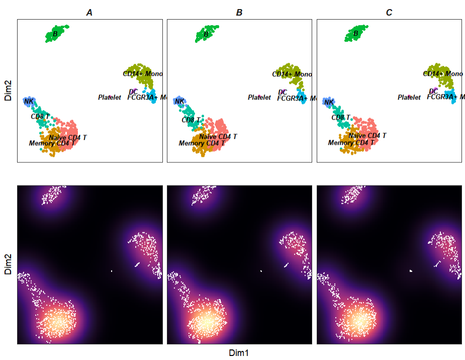
不错,非常有那味了。
4结尾
路漫漫其修远兮,吾将上下而求索。
欢迎加入生信交流群。加我微信我也拉你进 微信群聊 老俊俊生信交流群 (微信交流群需收取 20 元入群费用,一旦交费,拒不退还!(防止骗子和便于管理)) 。QQ 群可免费加入, 记得进群按格式修改备注哦。
声明:文中观点不代表本站立场。本文传送门:https://eyangzhen.com/389687.html