
论文
A high-quality genome compendium of the human gut microbiome of Inner Mongolians
2023Naturemicrobiology--Ahigh-qualitygenomecompendiumofthehumangutmicrobiomeofInnerMongolians4.pdf
论文中大部分作图数据都有,争取把论文中的图都复现一下
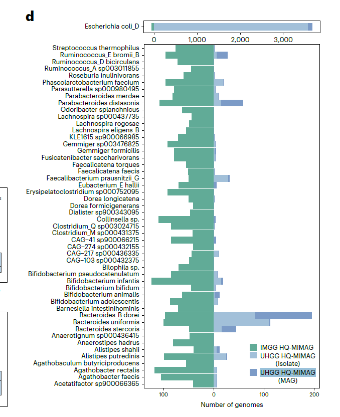
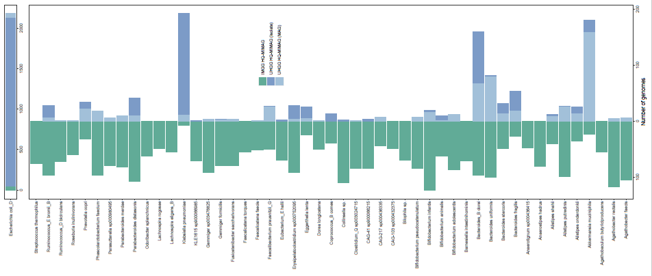
今天的推文我们试着复现一下论文中的Figure2d

部分示例数据截图
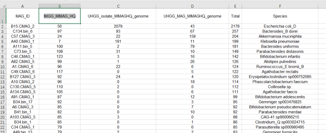
数据预处理
将数据分成两个部分,一个部分用于话朝左的柱形图,一个部分用于画朝右的堆积柱形图
library(tidyverse)
library(readxl)
dat<-read_excel("data/20230305/41564_2022_1270_MOESM5_ESM.xlsx",
                sheet = "Fig2d")
dat %>% colnames()

dat %>%
  filter(Species != "Escherichia coli_D") %>%
  mutate(IMGG_MIMAG_HQ=-IMGG_MIMAG_HQ) %>%
  select(IMGG_MIMAG_HQ,Species) -> dat.01

head(dat.01)
dim(dat.01)

dat %>%
  filter(Species != "Escherichia coli_D") %>%

  select(UHGG_isolate_MIMAGHQ_genome,
         UHGG_MAG_MIMAGHQ_genome,
         Species) %>%
  pivot_longer(!Species) -> dat.02
作图代码
这里图例的处理方式是单独构造一个画图例的数据作图,然后在图中把图例提取出来插入到完整的图中
legend.df<-data.frame(group=c("A","B","D"),
                      x=1,
                      y=c(1,1,1))
ggplot(data=legend.df,aes(x=x,y=y))+
  geom_bar(aes(fill=group),stat="identity")+
  scale_fill_manual(values = c("#61ab97","#7c9bc7","#a2c0d9"),
                    labels=c("IMGG HQ-MIMAG",
                             "UHGG HQ-MIMAG (isolate)",
                             "UHGG HQ-MIMAG (MAG)"),
                    name=NULL)+
  theme(legend.background = element_rect(fill="transparent"))-> legend.p

ggpubr::get_legend(legend.p)

ggplot()+
  geom_col(data=dat.01,
           aes(x=IMGG_MIMAG_HQ,y=Species),
           fill="#61ab97")+
  geom_bar(data=dat.02,
           aes(x=value,y=Species,
               fill=name),
           stat="identity")+
  scale_fill_manual(values = c("#7c9bc7","#a2c0d9"))+
  theme_bw()+
  theme(panel.grid = element_blank(),
        legend.position = "none")+
  scale_x_continuous(breaks = c(-100,0,100,200),
                     labels=c(100,0,100,200))+
  labs(x="Number of genomes",y=NULL)+
  annotation_custom(grob = ggpubr::get_legend(legend.p),
                    xmin = 120,xmax = 120,
                    ymin = 30,ymax=30) -> p1
p1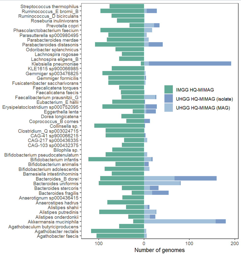
然后是顶部的图
dat %>%
  filter(Species == "Escherichia coli_D") %>%
  select(-MAG_ID,-Total) %>%
  pivot_longer(!Species) %>%
  ggplot(aes(x=value,y=Species,fill=name))+
  geom_bar(stat="identity")+
  scale_fill_manual(values = rev(c("#61ab97","#7c9bc7","#a2c0d9")))+
  theme_bw()+
  theme(legend.position = "none",
        panel.grid = element_blank())+
  labs(x=NULL,y=NULL) -> p2

p2
最后将两个图拼到一起
library(patchwork)
p2+p1+
  plot_layout(ncol = 1,heights = c(1,49))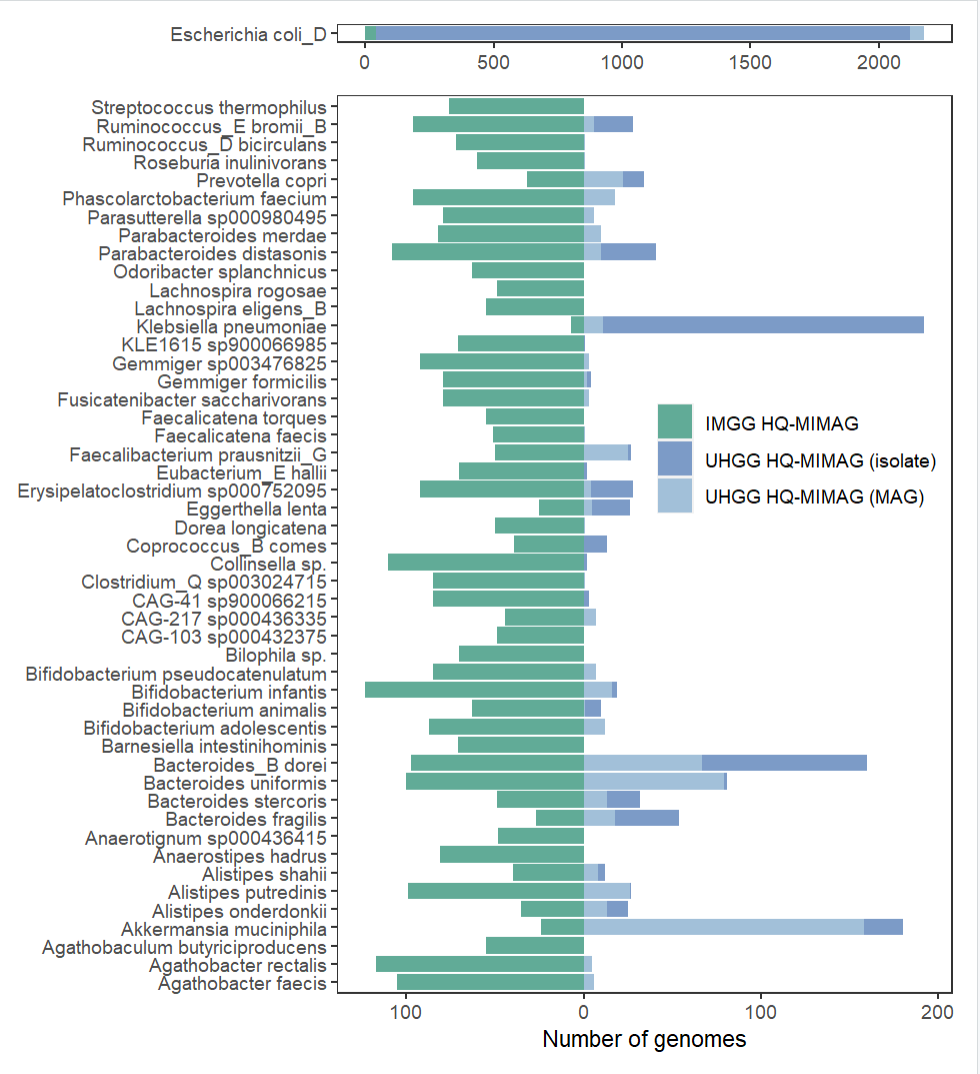
推文记录的是自己的学习笔记,内容可能会存在错误,请大家批判着看,欢迎大家指出其中的错误
示例数据和代码可以给推文打赏1元获取
声明:文中观点不代表本站立场。本文传送门:https://eyangzhen.com/47710.html