
论文
Chromosome-level assemblies of multiple Arabidopsis genomes reveal hotspots of rearrangements with altered evolutionary dynamics
拟南芥NC_panGenome.pdf
分析代码的github主页
论文中组装了7个拟南芥的基因组,做了一些泛基因组相关的分析,数据和大部分代码都公开了,我们试着复现一下其中的图和一些分析过程,今天的推文复现一下论文中的figure2d 下侧的小图,泛基因组分析的论文里通常都有这个图
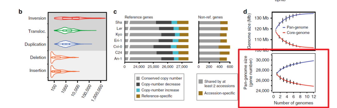

这个展示的也是基因家族,先用orthorfinder做聚类,然后利用orthorfinder的结果进行统计,作图数据整理成了如下格式,数据有两个,一个是泛基因组的基因家族数量,一个是核心基因家族的数量,如何根据orthorfinder结果统计得到这个表格,论文对应的github主页也提供了相应的脚本,今天主要介绍画图
论文中提供的代码是用R语言的基础绘图函数做的,这里我们用ggplot2来作图
首先是核心基因家族
可以用连续的点或者我也看到有用箱线图做的
这里我用箱线图,看起来可能会好看一点
library(tidyverse)
library(ggplot2)

dat01<-read.table("data/20230318/Source_Data.Figure2/Fig2d/pan-genome.gene.clustering.core-genome.txt",
                  header = FALSE)

ggplot()+
  geom_boxplot(data=dat01,aes(x=factor(V1),y=V2),fill="#3ba889")
拟合模型并添加拟合曲线
xvalue_core<-dat01 %>% pull(V1)
yvalue_core<-dat01 %>% pull(V2)

model_core<-nls(yvalue_core~A*exp(B*xvalue_core)+C,
                start = list(A=800,B=-0.3,C=800))
summary(model_core)

dat_core<-data.frame(x=seq(1,8,by=0.1),
                     y=predict(model_core,newdata = data.frame(xvalue_core=seq(1,8,by=0.1))))

ggplot()+
  geom_boxplot(data=dat01,aes(x=factor(V1),y=V2),fill="#3ba889")+
  geom_line(data=dat_core,aes(x=x,y=y),
            lty="dashed")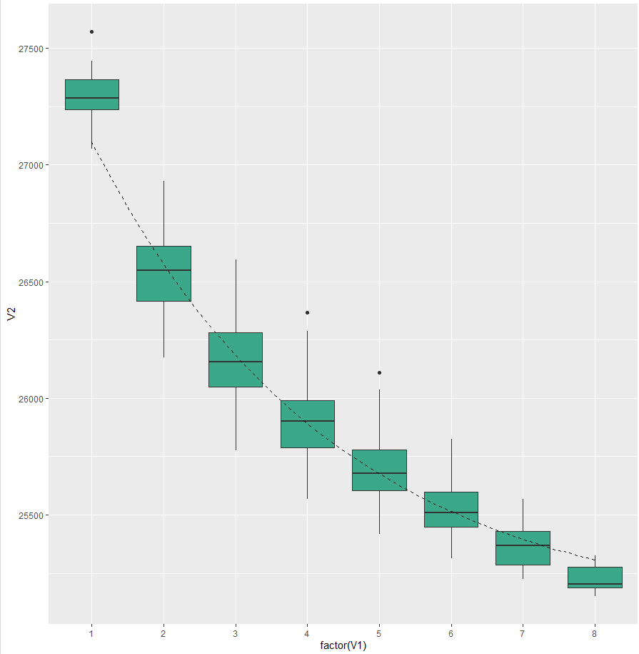
泛基因组
dat02<-read.table("data/20230318/Source_Data.Figure2/Fig2d/pan-genome.gene.clustering.pan-genome.txt",
                  header = FALSE)

xvalue_pan<-dat02 %>% pull(V1)
yvalue_pan<-dat02 %>% pull(V2)

model_pan<-nls(yvalue_pan~A*exp(B*xvalue_pan)+C,
             start = list(A=800,B=-0.3,C=800))
model_pan
summary(model_pan)
dat_pan<-data.frame(x=seq(1,8,by=0.1),
                    y=predict(model_pan,newdata = data.frame(xvalue_pan=seq(1,8,by=0.1))))
合起来作图和美化
ggplot()+
  geom_boxplot(data=dat01,aes(x=factor(V1),y=V2),fill="#3ba889")+
  geom_line(data=dat_core,aes(x=x,y=y),
            lty="dashed")+
  geom_boxplot(data=dat02,aes(x=factor(V1),y=V2),fill="#4593c3")+
  geom_line(data=dat_pan,aes(x=x,y=y),
            lty="dashed")+
  theme_bw()+
  theme(panel.grid = element_blank())+
  labs(x="Number of genomes",y="Pan-enome sizen(gene number)") -> p1

ggplot()+
  geom_boxplot(data=dat01,aes(x=factor(V1),y=V2),fill="#f18e0c")+
  geom_line(data=dat_core,aes(x=x,y=y),
            lty="dashed")+
  geom_boxplot(data=dat02,aes(x=factor(V1),y=V2),fill="#af2934")+
  geom_line(data=dat_pan,aes(x=x,y=y),
            lty="dashed")+
  theme_bw()+
  theme(panel.grid = element_blank())+
  labs(x="Number of genomes",y="Pan-enome sizen(gene number)") -> p2

p2

library(patchwork)
p1+p2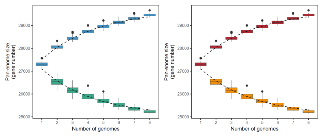
这里有个问题是nls()函数拟合的时候会有一个start参数,这个参数里的值怎么确定,暂时没有想明白
示例数据和代码可以给推文点赞,然后点击在看,最后留言获取
欢迎大家关注我的公众号
小明的数据分析笔记本
声明:文中观点不代表本站立场。本文传送门:https://eyangzhen.com/156145.html