
1引言
一位绘图大佬问我怎么在 circos.heatmap 绘制的环形热图里添加显著性,大概整理了一下,下面分享一些思路。


2探索
你去看 circlize 绘制热图这一章节说明书时,确实没有讲解怎么在格子里添加标签,但是我看到了在上一章节作者展示如何用循环绘制热图的:
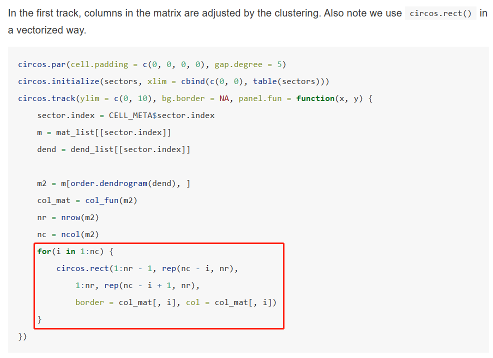
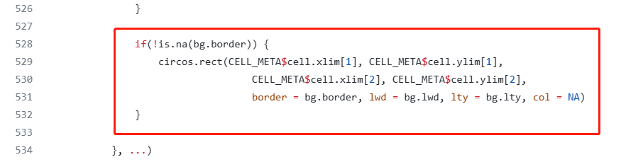
我们可以看到在这个红框这是循环添加格子的代码:
那么我们在这里也用循环为每一个格子添加一些 标记就行了,我们试试。
library(circlize)

mat = matrix(rnorm(10*10), nrow = 10, ncol = 10)
rownames(mat) = paste0("R", 1:10)
colnames(mat) = paste0("C", 1:10)

col_fun = colorRamp2(c(-2, 0, 2), c("green", "white", "red"))
sectors = rep(letters[1:2], times = c(5, 5))
mat_list = list(a = mat[sectors == "a", ],
                b = mat[sectors == "b", ])
dend_list = list(a = as.dendrogram(hclust(dist(mat_list[["a"]]))),
                 b = as.dendrogram(hclust(dist(mat_list[["b"]]))))
绘图:
circos.par(cell.padding = c(0, 0, 0, 0), gap.degree = 5)
circos.initialize(sectors, xlim = cbind(c(0, 0), table(sectors)))
circos.track(ylim = c(0, 9),track.height = 0.6, bg.border = NA, panel.fun = function(x, y) {
  sector.index = CELL_META$sector.index
  m = mat_list[[sector.index]]
  dend = dend_list[[sector.index]]

  m2 = m[order.dendrogram(dend), ]
  col_mat = col_fun(m2)
  nr = nrow(m2)
  nc = ncol(m2)
  for(i in 1:nc) {
    circos.rect(1:nr - 1, rep(nc - i, nr),
                1:nr, rep(nc - i + 1, nr),
                border = col_mat[, i], col = col_mat[, i])
  }

  for (c in 1:nc) {
    for (r in 1:nr) {
      circos.text(x = r-0.5,y = c-0.5,labels = "*")
    }
  }
})


max_height = max(sapply(dend_list, function(x) attr(x, "height")))
circos.track(ylim = c(0, max_height), bg.border = NA, track.height = 0.3,
             panel.fun = function(x, y) {
               sector.index = get.cell.meta.data("sector.index")
               dend = dend_list[[sector.index]]
               circos.dendrogram(dend, max_height = max_height)
             })
circos.clear()
我们加了这样几行代码,循环每个格子,都添加 “*”:
for (c in 1:nc) {
    for (r in 1:nr) {
      circos.text(x = r-0.5,y = c-0.5,labels = "*")
    }
  }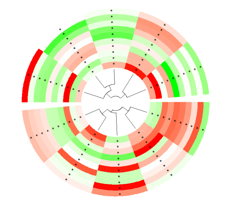
可以,达到了我们预期的效果,但是实际情况在,我们需要给不同的单元格来添加对应的标记,比如有些基因在有些样本里显著,有些不显著,所以我们还需要根据每个单元格位置对应的行和列来选择性的添加。
这里我们模拟生成一个标记矩阵,和表达矩阵维度一样:
sig <- c(rep("*",50),rep("",50))
mat1 <- matrix(sample(sig,100,replace = F), nrow = 10, ncol = 10)
rownames(mat1) = paste0("R", 1:10)
colnames(mat1) = paste0("C", 1:10)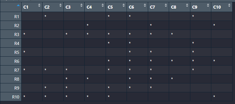
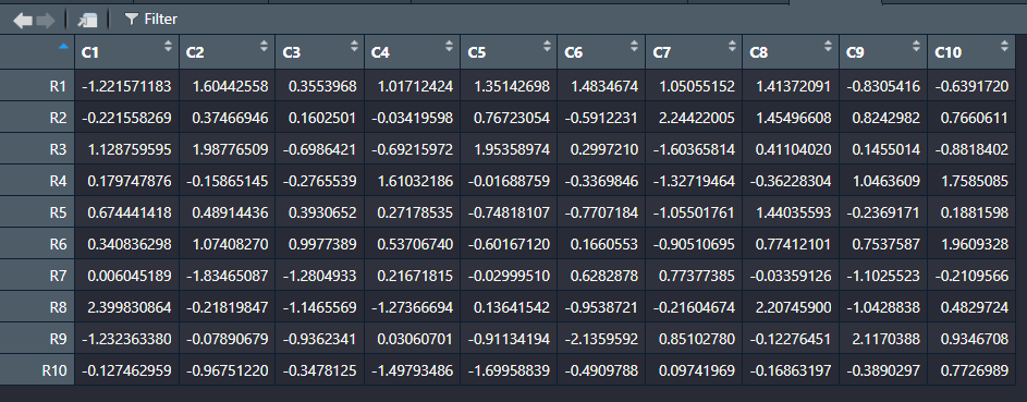
表达矩阵:
最后我们稍微改一下代码:
for (c in 1:nc) {
for (r in 1:nr) {
circos.text(x = r-0.5,y = c-0.5,labels = mat1[rownames(m2)[r],colnames(m2)[c]])
}
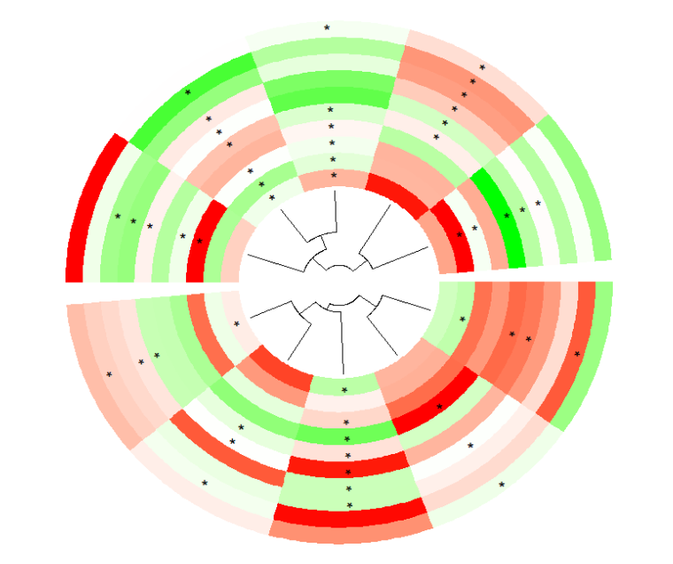
}然后我们画出来的图是这样的:
circos.heatmap 函数修改
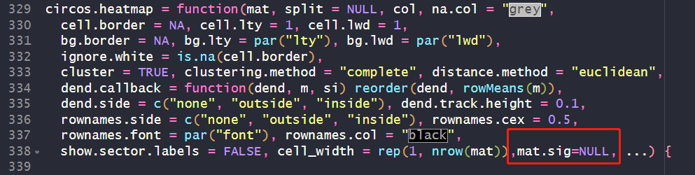
circlize 绘制环形热图包装了一个 circos.heatmap 函数,用来更方便的绘制各种类型的环形热图,针对以上问题,我们去看看这个函数的源码:
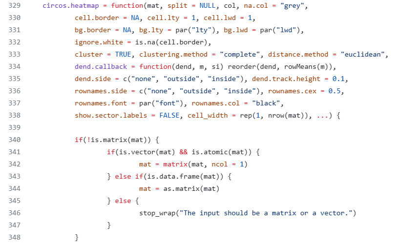
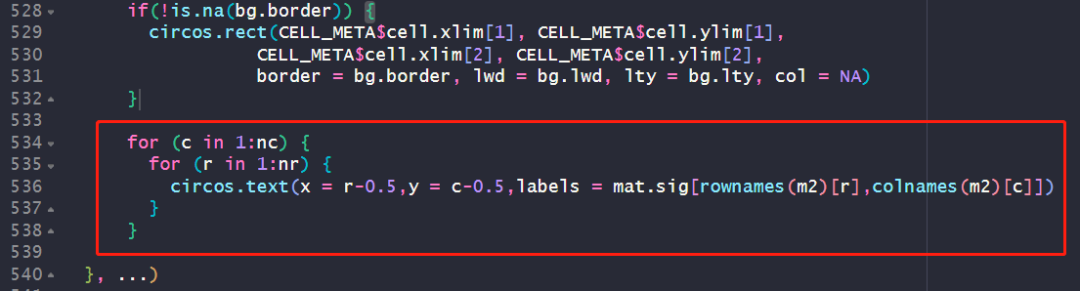
既然是包装的,那肯定有像我们上面那样循环绘制格子类似的代码,我们找找,在这里:
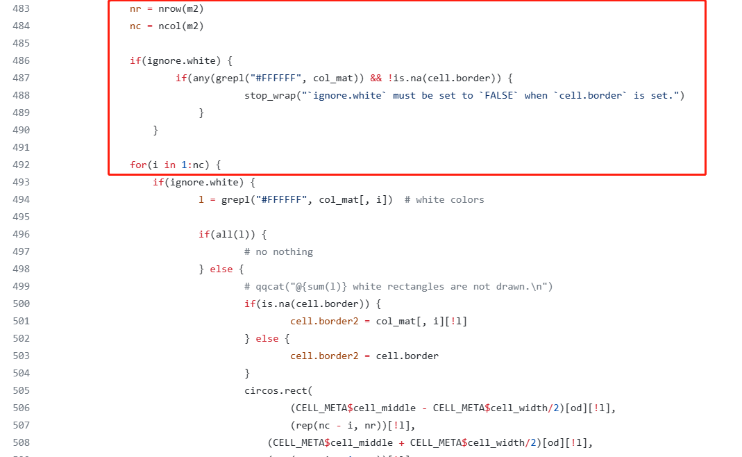
然后我们把这个函数按前面解决思路的代码稍微修改一下,再给这个函数给一个 mat.sig 的参数,来接受对应的标记矩阵,代码如下:
改好以后我们试试这个函数:
library(circlize)

mat = matrix(rnorm(10*10), nrow = 10, ncol = 10)
rownames(mat) = paste0("R", 1:10)
colnames(mat) = paste0("C", 1:10)
split = sample(letters[1:3], 10, replace = TRUE)
split = factor(split, levels = letters[1:3])

sig <- c(rep("*",50),rep("",50))
mat1 <- matrix(sample(sig,100,replace = F), nrow = 10, ncol = 10)
rownames(mat1) = paste0("R", 1:10)
colnames(mat1) = paste0("C", 1:10)

col_fun1 = colorRamp2(c(-2, 0, 2), c("blue", "white", "red"))
绘图:
circos.par(gap.after = c(2, 2, 10))
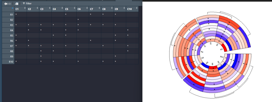
circos.heatmap(mat, split = split, col = col_fun1, dend.side = "outside",
rownames.side = "inside",
cell.border = "black",
track.height = 0.6,
mat.sig = mat1)
circos.clear()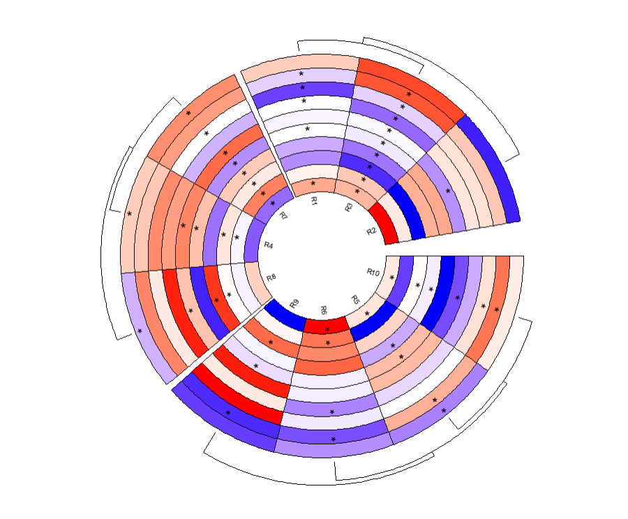
我们检查一下对应星号添加的位置和矩阵也是一一对应的,说明没有什么问题,然后你还可以结合使用circos.heatmap 含有的功能:
最后
最后你要想运行成功的话,需要把 circos.heatmap2.R 脚本里面的代码全选 run 一下,这个文件我放在 github(https://github.com/junjunlab/junjunlab)了,感兴趣的可自行去下载。

3结尾
路漫漫其修远兮,吾将上下而求索。
欢迎加入生信交流群。加我微信我也拉你进 微信群聊 老俊俊生信交流群 (微信交流群需收取 20 元入群费用,一旦交费,拒不退还!(防止骗子和便于管理)) 。QQ 群可免费加入, 记得进群按格式修改备注哦。
声明:文中观点不代表本站立场。本文传送门:https://eyangzhen.com/314741.html