
1引言
想必大部分可视化单细胞的绘图都是 ggplot 的,我们看看如果使用 lattice 来可视化单细胞。
2二维散点图
首先提取基因表达数据,这里我们返回 RunUMAP 的前 3 个主成分 n.components = 3:
library(SeuratData)
library(grid)
library(lattice)
library(latticeExtra)
library(Seurat)

# InstallData("pbmc3k")
data("pbmc3k")
rds <- UpdateSeuratObject(object = pbmc3k.final)

# return 3 PCs
rds <- RunUMAP(rds, dims = 1:10,n.components = 3)

object <- rds
# make PC data
reduc <- data.frame(Seurat::Embeddings(object, reduction = "umap"))

# metadata
meta <- object@meta.data

# combine
pc12 <- cbind(reduc, meta)
pc12$idents <- Idents(object)

# get gene expression
geneExp <- Seurat::FetchData(object = object, vars = c('CD79A', 'MS4A1', 'IGJ', 'CD3D'))

# cbind
mer <- cbind(pc12, geneExp)

rt_var <- colnames(mer)[-match(c('CD79A', 'MS4A1', 'IGJ', 'CD3D'),colnames(mer))]
mer2 <- mer |>
  reshape2::melt(id.vars = rt_var,variable.name = "gene",value.name = "exp")

# check
head(mer2,3)
#      UMAP_1    UMAP_2     UMAP_3 orig.ident nCount_RNA nFeature_RNA seurat_annotations
# 1 -3.684521 -4.534336 -0.9474856     pbmc3k       2419          779       Memory CD4 T
# 2 -6.008923 10.567600  4.0053687     pbmc3k       4903         1352                  B
# 3 -5.700925 -2.645074 -2.3281191     pbmc3k       3147         1129       Memory CD4 T
#   percent.mt RNA_snn_res.0.5 seurat_clusters       idents  gene      exp
# 1  3.0177759               1               1 Memory CD4 T CD79A 0.000000
# 2  3.7935958               3               3            B CD79A 1.962726
# 3  0.8897363               1               1 Memory CD4 T CD79A 0.000000
绘图:
levelplot(exp ~ UMAP_1 * UMAP_2 | gene,data = mer2,
          panel = panel.levelplot.points,
          type = c("p", "g"),
          aspect = "iso",
          scales = list(alternating = 1,tck = c(1,0)),
          prepanel = prepanel.default.xyplot)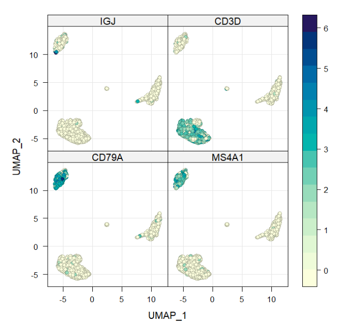

修改排列样式:
levelplot(exp ~ UMAP_1 * UMAP_2 | gene,data = mer2,
          panel = panel.levelplot.points,
          type = c("p", "g"),
          aspect = "iso",
          scales = list(alternating = 1,tck = c(1,0)),
          prepanel = prepanel.default.xyplot,
          layout = c(4,1))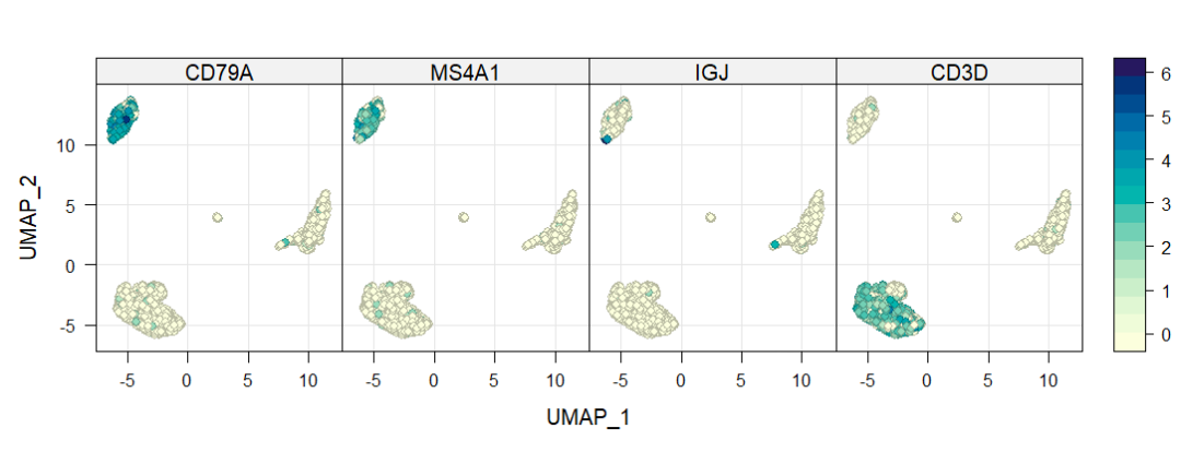
分面设置:
levelplot(exp ~ UMAP_1 * UMAP_2 | gene,data = mer2,
          panel = panel.levelplot.points,
          type = c("p", "g"),
          aspect = "iso",
          scales = list(alternating = 1,tck = c(1,0),relation = "free"),
          prepanel = prepanel.default.xyplot,
          layout = c(4,1))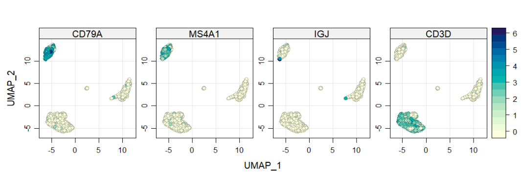
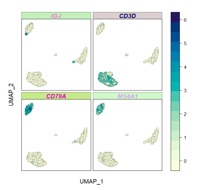
修改分面字体:
levelplot(exp ~ UMAP_1 * UMAP_2 | gene,data = mer2,
          panel = panel.levelplot.points,
          type = c("p", "g"),
          aspect = "iso",
          scales = list(alternating = 0,tck = c(0,0)),
          prepanel = prepanel.default.xyplot,
          strip = strip.custom(par.strip.text = list(fontface = "bold.italic")))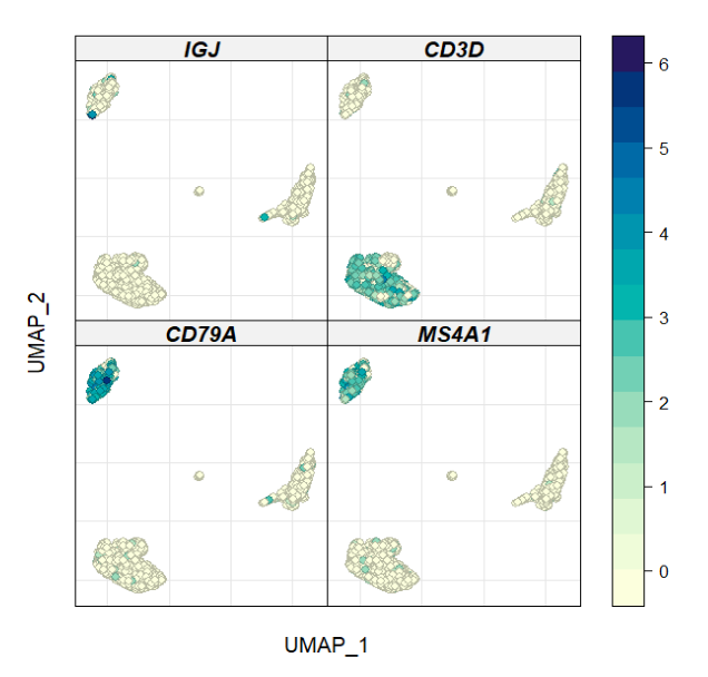
修改分面间距:
levelplot(exp ~ UMAP_1 * UMAP_2 | gene,data = mer2,
          panel = panel.levelplot.points,
          type = c("p", "g"),
          aspect = "iso",
          scales = list(alternating = 0,tck = c(0,0)),
          prepanel = prepanel.default.xyplot,
          strip = strip.custom(par.strip.text = list(fontface = "bold.italic")),
          between = list(x = 0.3,y = 0.3))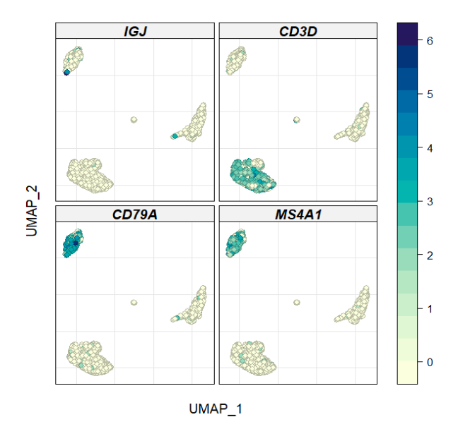
自定义分面:
levelplot(exp ~ UMAP_1 * UMAP_2 | gene,data = mer2,
          panel = panel.levelplot.points,
          type = c("p"),
          aspect = "iso",
          scales = list(alternating = 0,tck = c(0,0)),
          prepanel = prepanel.default.xyplot,
          between = list(x = 0.3,y = 0.3),
          strip = function(which.panel, factor.levels, strip.names,...) {
            panel.rect(0, 0, 1, 1,
                       col = circlize::rand_color(1),alpha = 0.5,border = "black")

            panel.text(x = 0.5, y = 0.5, font = "bold.italic",
                       lab = factor.levels[which.panel],
                       col = circlize::rand_color(1))
          })
修改颜色,图例,标签:
# create color palette
col.l <- colorRampPalette(c('grey90', '#B70404'))(100)

levelplot(exp ~ UMAP_1 * UMAP_2 | gene,data = mer2,
          panel = panel.levelplot.points,
          type = c("p"),
          aspect = "iso",
          scales = list(alternating = 0,tck = c(0,0)),
          prepanel = prepanel.default.xyplot,
          strip = strip.custom(par.strip.text = list(fontface = "bold.italic")),
          col.regions = col.l,
          layout = c(4,1),
          xlab = "UMAP 1",ylab = "UMAP 2",
          colorkey = list(space = "top",
                          tri.lower = T,tri.upper = T))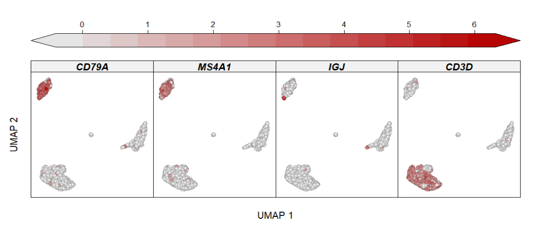
这效果也不输 ggplot 吧。
33 维散点图
假如你有多个分组的数据,可以这样展示,我们使用 3 个 PC 绘图:
# 3D plot
mer2$group <- sample(c("control","treat1","treat2","treat3"),nrow(mer2),replace = T)

cloud(UMAP_3 ~ UMAP_1 * UMAP_2 | group,data = mer2,
      type = c("p"),pch = 20,
      groups = seurat_annotations,
      layout = c(4,1),
      xlab = "UMAP 1", ylab = "UMAP 2",
      zlab = list("UMAP 3", rot = 90))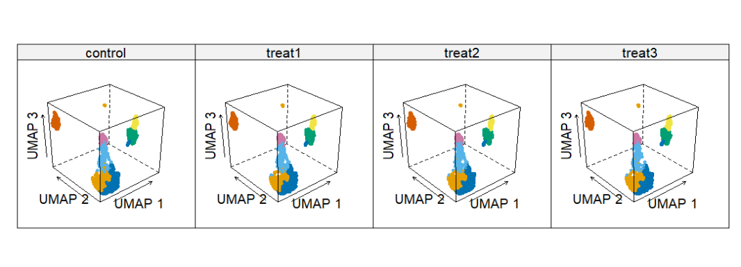
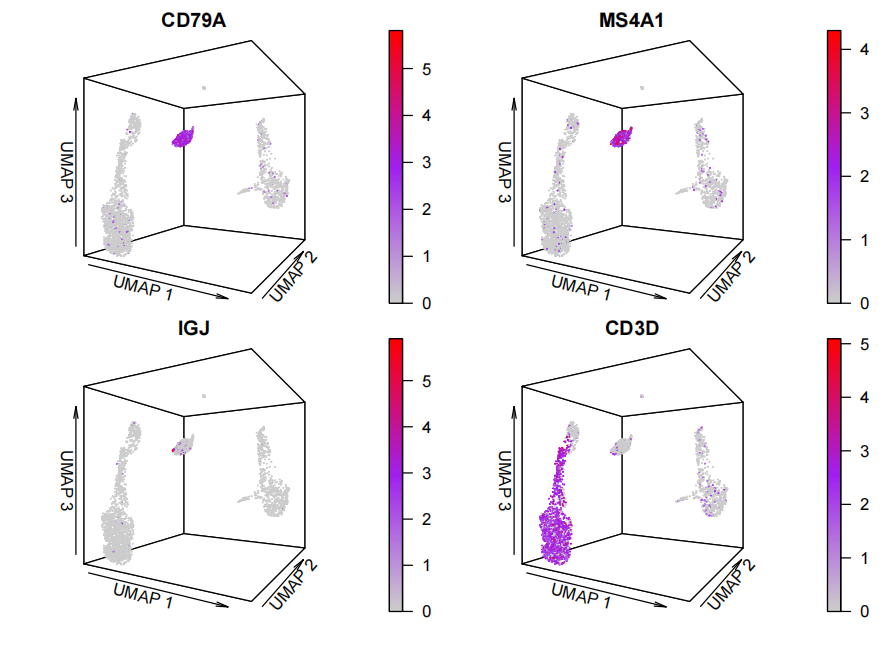
使用 plot3D 包可视化,颜色就代表基因表达量高低了:
library("plot3D")

par(mfrow = c(2,2),
    oma = c(5,4,0,0) + 0.1,
    mar = c(0,0,1,1) + 0.1)

for (i in c('CD79A', 'MS4A1', 'IGJ', 'CD3D')) {
  tmp <- mer2 |> dplyr::filter(gene == i)

  # plot
  scatter3D(x = tmp$UMAP_1,y = tmp$UMAP_2,z = tmp$UMAP_3,
            colvar = tmp$exp,
            pch = 19,cex = 0.1,
            theta = 30,phi = 0,
            colkey = list(dist = 0,length = 1,side = 4),
            # ticktype = "detailed",
            xlab = "UMAP 1",ylab = "UMAP 2",zlab = "UMAP 3",
            main = i,
            # bty = "g",
            col = colorRampPalette(c('grey80',"purple", 'red'))(100))
}
4结尾
路漫漫其修远兮,吾将上下而求索。
欢迎加入生信交流群。加我微信我也拉你进 微信群聊 老俊俊生信交流群 (微信交流群需收取 20 元入群费用,一旦交费,拒不退还!(防止骗子和便于管理)) 。QQ 群可免费加入, 记得进群按格式修改备注哦。
声明:文中观点不代表本站立场。本文传送门:https://eyangzhen.com/317341.html