
1引言
Deeptools 是目前比较流行的可视化软件,除此之外还有一款 R 包 EnrichedHeatmap, 不过感觉用的人似乎并不多,之前我也介绍过,这次我们拿数据实战一下。
安装:
if (!require("BiocManager", quietly = TRUE))
    install.packages("BiocManager")

BiocManager::install("EnrichedHeatmap")
数据:
在 GSE205706 上随便下载了一些 bigwig 文件:

2示例
首先准备一下基因的 TSS 数据 (你可以从 GTF 或者 UCSC 获取基因的位置信息的 bed 文件),使用 promoters函数提取 TSS 位点信息:
library(EnrichedHeatmap)
library(tidyverse)
library(GenomicRanges)
library(rtracklayer)
library(circlize)

hg38.bed <- read.delim("hg38.bed",header = F) |>
  mutate(seqnames = V1,start = V2,end = V3,strand = V6) |>
  select(seqnames,start,end,strand) |> head(1000) |> GRanges()

tss <- promoters(hg38.bed,upstream = 0, downstream = 1)
tss
# GRanges object with 1000 ranges and 0 metadata columns:
#   seqnames    ranges strand
#   <Rle> <IRanges>  <Rle>
#   [1]     chr1     11868      +
#   [2]     chr1     12009      +
bigwig 文件准备:
bw.files <- c("GSM6219545_K562-b1-Control-Input-r1_ChIP.bigWig",
              "GSM6219547_K562-b1-RBFOX2-KD-Input-r1_ChIP.bigWig",
              "GSM6219541_K562-b1-Control-H3K4me3-r1_ChIP.bigWig",
              "GSM6219543_K562-b1-RBFOX2-KD-H3K4me3-r1_ChIP.bigWig",
              "GSM6219549_K562-b2-Control-SUZ12-r1_ChIP.bigWig",
              "GSM6219557_K562-b3-Control-H3K27me3-r1_ChIP.bigWig",
              "GSM6219565_K562-b4-Control-YTHDC1-r1_ChIP.bigWig")

sample <- c("Control","RBFOX2-KD","Control-H3K4me3","RBFOX2-KD-H3K4me3",
            "Control-SUZ12","Control-H3K27me3","Control-YTHDC1")

bg_col <- RColorBrewer::brewer.pal(7, "Set2")
批量计算在 TSS 位置处的信号强度矩阵:
ht_list <- lapply(seq_along(bw.files), function(x){
  bw <- import.bw(bw.files[x])

  mat_trim = normalizeToMatrix(bw, genes, value_column = "score",
                               extend = 5000, mean_mode = "w0", w = 50,
                               # keep = c(0, 0.99),
                               background = 0, smooth = TRUE)

  col_fun = colorRamp2(quantile(mat_trim, c(0, 0.99)), c("grey95", bg_col[x]))
  # col_fun = colorRamp2(c(0,30), c("grey95", bg_col[x]))

  # plot
  ht <-
    EnrichedHeatmap(mat_trim, col = col_fun, name = sample[x],
                    column_title = sample[x],
                    column_title_gp = gpar(fontsize = 10,
                                           fill = bg_col[x]),
                    # top_annotation = HeatmapAnnotation(
                    #   enriched = anno_enriched(
                    #     ylim = c(0, 30))),
                    use_raster = F,
                    # show_heatmap_legend = lgd[x],
                    show_heatmap_legend = T
    )

  return(ht)
})
最后绘图保存:
# merge plot list
pdf("ht.pdf",width = 15,height = 8,onefile = F)
draw(Reduce("+",ht_list), ht_gap = unit(0.8, "cm"),
     heatmap_legend_side = "bottom")
dev.off()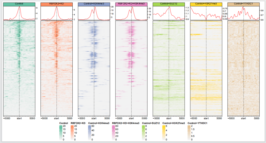
你可以看到这里的每个图的纵坐标都不一样,你也可以设置为一样的,这样可以展示不同条件下信号强度的差异:
lgd <- rep(c("T","F"),c(1,6))

# loop plot
ht_list2 <- lapply(seq_along(bw.files), function(x){
  bw <- import.bw(bw.files[x])

  mat_trim = normalizeToMatrix(bw, tss, value_column = "score",
                               extend = 5000, mean_mode = "w0", w = 50,
                               # keep = c(0, 0.99),
                               background = 0, smooth = TRUE)

  # col_fun = colorRamp2(quantile(mat_trim, c(0, 0.99)), c("grey95", bg_col[x]))
  col_fun = colorRamp2(c(0,30), c("grey95", bg_col[x]))

  # plot
  ht <-
    EnrichedHeatmap(mat_trim, col = col_fun, name = sample[x],
                    column_title = sample[x],
                    column_title_gp = gpar(fontsize = 10,
                                           fill = bg_col[x]),
                    top_annotation = HeatmapAnnotation(
                      enriched = anno_enriched(
                        ylim = c(0, 30))),
                    use_raster = F,
                    show_heatmap_legend = lgd[x],
                    # show_heatmap_legend = T
    )

  return(ht)
})

# merge plot list
pdf("ht_scale_y.pdf",width = 15,height = 6,onefile = F)
draw(Reduce("+",ht_list2), ht_gap = unit(0.8, "cm"),
     heatmap_legend_side = "right")
dev.off()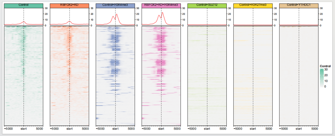
3生物学重复样本处理
有时候你可能有多个生物学重复样本,也许你想把它们合并,我们先看看各自的图形:
rep_file <- c("GSM6219545_K562-b1-Control-Input-r1_ChIP.bigWig",
              "GSM6219546_K562-b1-Control-Input-r2_ChIP.bigWig",
              "GSM6219541_K562-b1-Control-H3K4me3-r1_ChIP.bigWig",
              "GSM6219542_K562-b1-Control-H3K4me3-r2_ChIP.bigWig")

sample <- c("Input-r1","Input-r2","H3K4me3-r1","H3K4me3-r2")

lgd <- rep(c("T","F"),c(1,3))

# loop
# x = 1
lapply(1:4, function(x){
  bw <- import.bw(rep_file[x])

  mat <- normalizeToMatrix(bw, tss,
                           value_column = "score",
                           extend = 5000, mean_mode = "w0", w = 50,
                           background = 0, smooth = TRUE)

  # col_fun = colorRamp2(quantile(mat, c(0, 0.99)), c("grey95", bg_col[x]))
  col_fun = colorRamp2(c(0,20), c("grey95", bg_col[x]))

  # plot
  ht <-
    EnrichedHeatmap(mat, col = col_fun, name = sample[x],
                    column_title = sample[x],
                    column_title_gp = gpar(fontsize = 10,
                                           fill = bg_col[x]),
                    top_annotation = HeatmapAnnotation(
                      enriched = anno_enriched(
                        ylim = c(0, 20))),
                    use_raster = F,
                    show_heatmap_legend = lgd[x],
                    # show_heatmap_legend = T
    )

  return(ht)
}) -> ht_list4

# merge plot list
pdf("ht_rep_samples.pdf",width = 8,height = 6,onefile = F)
draw(Reduce("+",ht_list4), ht_gap = unit(0.8, "cm"),
     heatmap_legend_side = "right")
dev.off()
EnrichedHeatmap 提供了合并生物学重复的方法,取均值:
rep_file <- c("GSM6219545_K562-b1-Control-Input-r1_ChIP.bigWig",
              "GSM6219546_K562-b1-Control-Input-r2_ChIP.bigWig",
              "GSM6219541_K562-b1-Control-H3K4me3-r1_ChIP.bigWig",
              "GSM6219542_K562-b1-Control-H3K4me3-r2_ChIP.bigWig")

sample <- c("Control-Input","Control-H3K4me3")

# loop
# x = 1
lapply(1:2, function(x){
  rep_list <- lapply(c(x,x+1), function(x){
    bw <- import.bw(rep_file[x])
  })

  mat_list = NULL
  for(i in seq_along(rep_list)) {
    mat_list[[i]] = normalizeToMatrix(rep_list[[i]], tss,
                                      value_column = "score",
                                      extend = 5000, mean_mode = "w0", w = 50,
                                      background = 0, smooth = TRUE)
  }

  # get mean values
  mat_mean = getSignalsFromList(mat_list)

  # col_fun = colorRamp2(quantile(mat_mean, c(0, 0.99)), c("grey95", bg_col[x]))
  col_fun = colorRamp2(c(0,30), c("grey95", bg_col[x]))

  # plot
  ht <-
    EnrichedHeatmap(mat_mean, col = col_fun, name = sample[x],
                    column_title = sample[x],
                    column_title_gp = gpar(fontsize = 10,
                                           fill = bg_col[x]),
                    top_annotation = HeatmapAnnotation(
                      enriched = anno_enriched(
                        ylim = c(0, 30))),
                    use_raster = F,
                    # show_heatmap_legend = lgd[x],
                    show_heatmap_legend = T
    )

  return(ht)
}) -> ht_list3

# merge plot list
pdf("ht_rep_mean.pdf",width = 6,height = 6,onefile = F)
draw(Reduce("+",ht_list3), ht_gap = unit(0.8, "cm"),
     heatmap_legend_side = "right")
dev.off()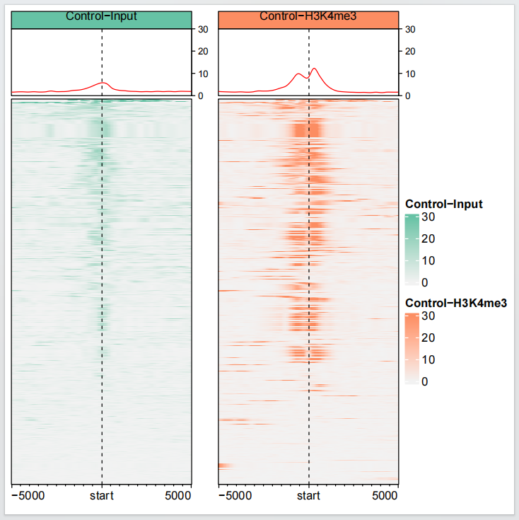
4分类
有时候我们希望给我们鉴定到的结合位点进行分类,然后进行可视化,下面展示一个例子:
rep_file <- c("GSM6219545_K562-b1-Control-Input-r1_ChIP.bigWig",
              "GSM6219546_K562-b1-Control-Input-r2_ChIP.bigWig",
              "GSM6219541_K562-b1-Control-H3K4me3-r1_ChIP.bigWig",
              "GSM6219542_K562-b1-Control-H3K4me3-r2_ChIP.bigWig")

sample <- c("Input-r1","Input-r2","H3K4me3-r1","H3K4me3-r2")

lgd <- rep(c("T","F"),c(1,3))

row_split = sample(c("A", "B","C"), length(tss), replace = TRUE)

# loop
# x = 1
lapply(1:4, function(x){
  bw <- import.bw(rep_file[x])

  mat <- normalizeToMatrix(bw, tss,
                           value_column = "score",
                           extend = 5000, mean_mode = "w0", w = 50,
                           background = 0, smooth = TRUE)

  # col_fun = colorRamp2(quantile(mat, c(0, 0.99)), c("grey95", bg_col[x]))
  col_fun = colorRamp2(c(0,25), c("grey95", bg_col[x]))

  # plot
  ht <-
    EnrichedHeatmap(mat, col = col_fun, name = sample[x],
                    column_title = sample[x],
                    column_title_gp = gpar(fontsize = 10,
                                           fill = bg_col[x]),
                    top_annotation = HeatmapAnnotation(
                      lines = anno_enriched(gp = gpar(col = 2:4),ylim = c(0, 25))
                    ),
                    use_raster = F,
                    # row_split = row_split,
                    # show_heatmap_legend = lgd[x],
                    show_heatmap_legend = T
    )

  return(ht)
}) -> ht_list5

# merge plot list
pdf("ht_rep_samples_clusters.pdf",width = 8,height = 6,onefile = F)
draw(Heatmap(row_split, col = structure(2:4, names = c("A","B","C")),
             name = "cluster",
             show_row_names = FALSE, width = unit(3, "mm")) +
       Reduce("+",ht_list5),
     ht_gap = unit(c(0.1,0.8,0.8,0.8), "cm"),
     heatmap_legend_side = "bottom",
     split = row_split)
dev.off()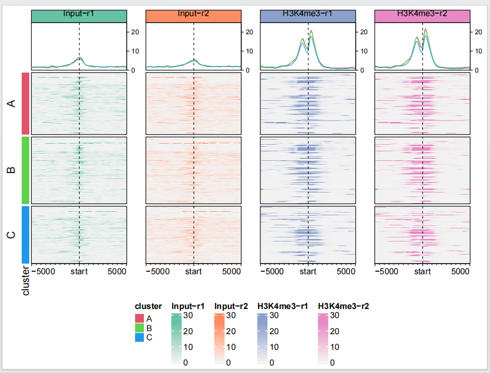
5提取 profile 图
有时候可能你只想展示 profile 图形,下面展示了怎么从已绘制的图形中提取出来:
# extract profile
htlist <- draw(Heatmap(row_split, col = structure(2:4, names = c("A","B","C")),
                       name = "cluster",
                       show_row_names = FALSE, width = unit(3, "mm")) +
                 Reduce("+",ht_list5),
               ht_gap = unit(c(0.1,0.8,0.8,0.8), "cm"),
               heatmap_legend_side = "bottom",
               split = row_split)

# extract profile
add_anno_enriched = function(ht_list, name, ri, ci) {
  pushViewport(viewport(layout.pos.row = ri, layout.pos.col = ci))
  extract_anno_enriched(ht_list, name, newpage = FALSE)
  upViewport()
}

# save
pdf("profile.pdf",width = 16,height = 4,onefile = F)
grid.newpage()
pushViewport(viewport(layout = grid.layout(nr = 1, nc = 4)))
add_anno_enriched(htlist,2 ,1, 1)
add_anno_enriched(htlist,3 ,1, 2)
add_anno_enriched(htlist,4 ,1, 3)
add_anno_enriched(htlist,5 ,1, 4)
upViewport()
dev.off()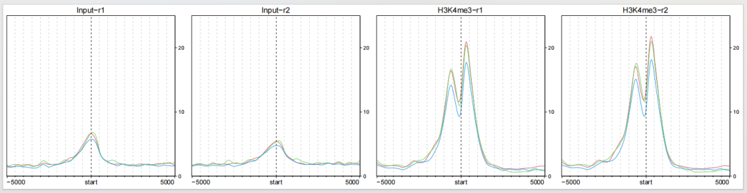
6提取数据 ggplot 绘图
如果你对上面的图形不太满意,甚至你可以自己提取数据进行绘图,这里自己写了一些简单的代码进行可视化:
profile:
library(ggplot2)
library(ggh4x)
library(colorspace)

# loop extract profile data
purrr::map_df(seq_along(ht_list5),function(x){
  norm_mat <- ht_list5[[x]]@matrix

  # =====================
  # extract profile data
  # group for rows
  # x = "A"
  purrr::map_df(sort(unique(row_split)),function(split){
    idx <- base::grep(split,row_split)

    mean_mat <- apply(norm_mat[idx,], 2, mean)

    # profile to df
    mat_df <- data.frame(density = mean_mat,
                         x = seq(-5000,5000,length.out = length(mean_mat)),
                         sample = ht_list5[[x]]@name,
                         split = split)
    return(mat_df)
  }) -> df.profile

  return(df.profile)
}) -> df.profile

# plot
ggplot(df.profile) +
  geom_line(aes(x = x,y = density,color = split)) +
  theme_bw() +
  theme(panel.grid = element_blank()) +
  facet_wrap(~sample,nrow = 1) +
  xlab("") +
  scale_color_brewer(palette = "Set1")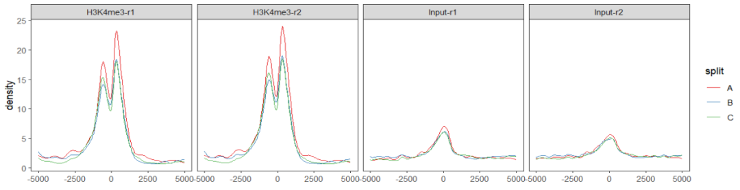
heatmap:
# loop extract heatmap data
# x = 1
purrr::map_df(seq_along(ht_list5),function(x){
  norm_mat <- ht_list5[[x]]@matrix

  # =====================
  # extract heatmap data
  purrr::map_df(sort(unique(row_split)),function(split){
    idx <- base::grep(split,row_split)

    tmp_mat <- data.frame(norm_mat[idx,])
    colnames(tmp_mat) <- seq(-5000,5000,length.out = ncol(tmp_mat))
    tmp_mat$y <- rownames(tmp_mat)
    # tmp_mat$rowsum <- rowSums(tmp_mat)

    df.long <- reshape2::melt(tmp_mat,id.vars = "y")
    colnames(df.long)[2] <- c("x")
    df.long$split <- split
    df.long$sample <- ht_list5[[x]]@name
    df.long$x <- as.numeric(unfactor(df.long$x))
    df.long$y <- as.numeric(df.long$y)

    return(df.long)
  }) -> df.heatmap

  # deal with extreme values
  q99 <- quantile(df.heatmap$value,c(0,0.99))
  df.heatmap.new <- df.heatmap |>
    mutate(value = ifelse(value > q99[2],q99[2],value))

  # orders
  ht.sm <- df.heatmap |>
    group_by(split,y) |>
    summarise(rowsum = sum(value)) |>
    arrange(split,rowsum) |> ungroup()

  # # assign orders for each row split
  # sp = "A"
  map_df(unique(row_split),function(sp){
    tmp.sm <- subset(ht.sm,split == sp)
    tmp.heatmap <- subset(df.heatmap.new,split == sp)

    tmp.heatmap$y <- factor(tmp.heatmap$y,levels = tmp.sm$y)

    return(tmp.heatmap)
  }) -> df.heatmap.final

  return(df.heatmap.final)
}) -> df.heatmap

# plot
ggplot(df.heatmap) +
  geom_raster(aes(x = x,y = y,fill = value)) +
  theme_bw() +
  theme(panel.grid = element_blank()) +
  facet_grid2(split~sample,switch = "y") +
  xlab("") + ylab("") +
  scale_fill_continuous_sequential(palette = "Reds 3") +
  coord_cartesian(expand = 0) +
  theme(strip.placement = "outside",
        axis.ticks.y = element_blank(),
        axis.text.y = element_blank(),
        panel.spacing.x = unit(0.6,"cm"),
        axis.text.x = element_text(angle = 45,hjust = 1))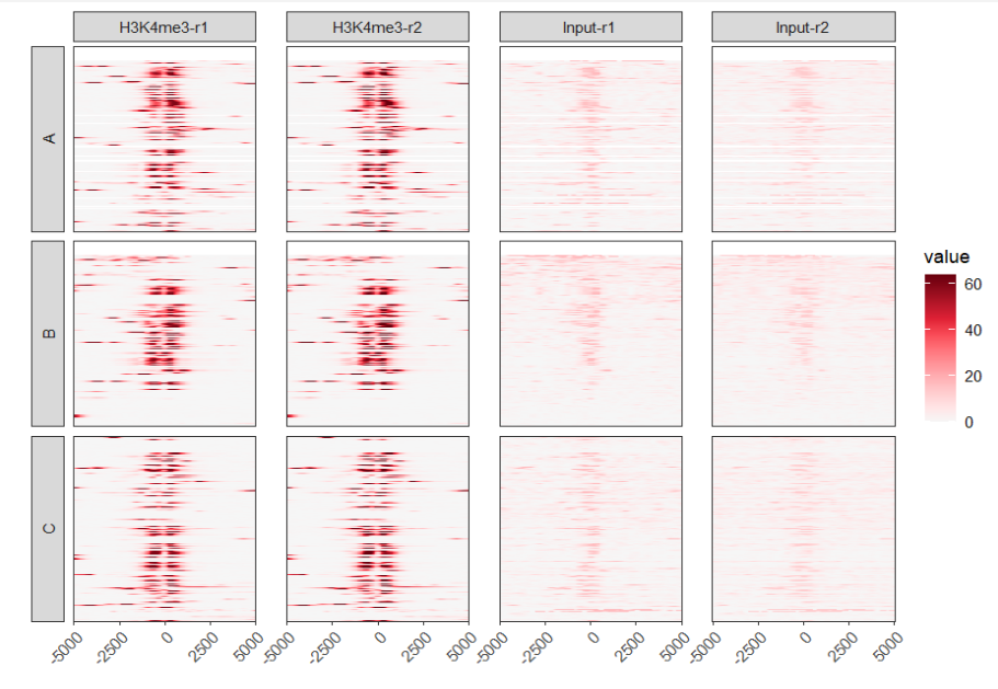
你也可以使用 aplot 把 profile 和 heatmap 拼起来,下面是个简单示例,具体细节你可以自己进一步调整:
# aplot plots
sp <- unique(df.profile$sample)

# loop plot
lapply(sp, function(s){
  ptop <- ggplot(df.profile |> dplyr::filter(sample %in% s)) +
    geom_line(aes(x = x,y = density,color = split)) +
    theme_bw() +
    theme(panel.grid = element_blank(),
          axis.text.x = element_blank(),
          plot.margin = margin(t = 0.2,r = .2,b = -0.2,l = .2,
                               unit = "cm"),
          axis.title.x = element_blank(),
          axis.ticks.x = element_blank()) +
    facet_wrap(~sample,nrow = 1) +
    xlab("") +
    scale_color_brewer(palette = "Set1")

  pbom <-
    ggplot(df.heatmap |> filter(sample %in% s)) +
    geom_raster(aes(x = x,y = y,fill = value)) +
    theme_bw() +
    theme(panel.grid = element_blank()) +
    facet_grid2(split~.,switch = "y") +
    xlab("") + ylab("") +
    scale_fill_continuous_sequential(palette = "Reds 3") +
    coord_cartesian(expand = 0) +
    theme(strip.placement = "outside",
          axis.ticks.y = element_blank(),
          axis.text.y = element_blank(),
          plot.margin = margin(t = 0,r = .2,b = .2,l = .2,
                               unit = "cm"),
          panel.spacing.x = unit(0.6,"cm"),
          axis.text.x = element_text(angle = 45,hjust = 1))

  # merge
  pmer <- aplot::plot_list(gglist = list(ptop,pbom),ncol = 1)

  return(pmer)
}) -> plist

cowplot::plot_grid(plotlist = plist,nrow = 1)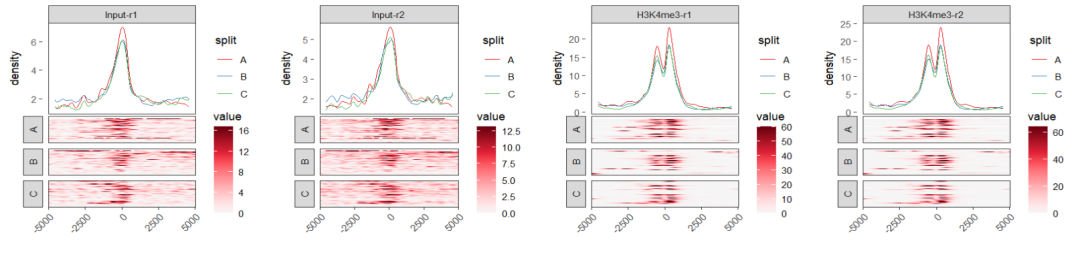
7结尾
路漫漫其修远兮,吾将上下而求索。
欢迎加入生信交流群。加我微信我也拉你进 微信群聊 老俊俊生信交流群 (微信交流群需收取 20 元入群费用,一旦交费,拒不退还!(防止骗子和便于管理)) 。QQ 群可免费加入, 记得进群按格式修改备注哦。
声明:文中观点不代表本站立场。本文传送门:https://eyangzhen.com/343570.html