
论文
Genomic insights into local adaptation and future climate-induced vulnerability of a keystone forest tree in East Asia
论文中提供的代码链接
论文中提供的数据在 Source data 部分获取
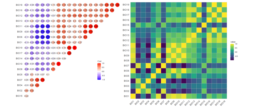
环境变量的相关性对应的论文中的 Supplementary Fig. 9. a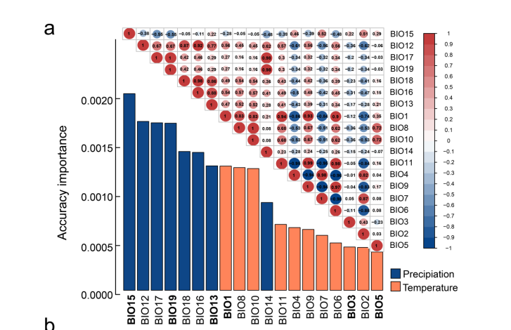

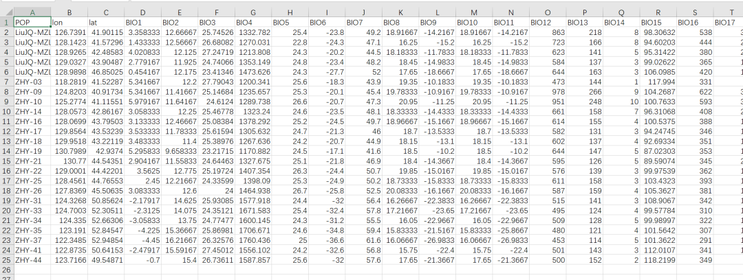
论文中提供的环境数据的部分截图
读取数据
library(tidyverse)
raw_data<-read_csv("data/20231110/Source data/Fig2c&d/environment.csv") %>%
  select(-c(1,2,3))
计算相关性
corrmatrix <- cor(raw_data, method = "spearman")
corrmatrix
相关性检验
res1 <-corrplot::cor.mtest(corrmatrix, conf.level= .95)

res1$p
res1$lowCI
res1$uppCI
论文中提供的作图代码
col3 <- grDevices::colorRampPalette(c("#2082DD", "white", "#FF3F3F"))
col3

corrplot::corrplot.mixed(corr=corrmatrix,
                         lower="number",
                         upper="circle",
                         diag="u",
                         upper.col =col3(20),
               lower.col = col3(20),
               number.cex=0.9,
               p.mat= res1$p,
               sig.level= 0.05,
               bg = "white",
               is.corr = TRUE,
               outline = FALSE,
               mar = c(0,0,3,0),
               addCoef.col = NULL,
               addCoefasPercent = FALSE,
               order = c("original"),
               rect.col = "black",
               rect.lwd = 1,
               tl.cex = 1.2,
               tl.col = "black",
               tl.offset = 0.4,
               tl.srt = 90,
               cl.cex = 1.1,
               cl.ratio = 0.2,
               tl.pos="lt",
               cl.offset = 0.5 )
title(main="Correlation coefficient of 19 environmental variables",cex.main=2.1)
出图效果
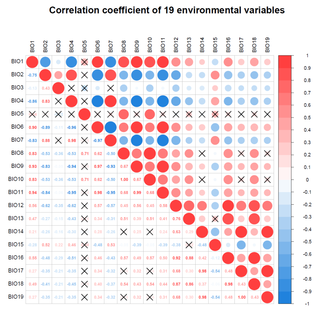
这个有好多参数,参数具体都有什么作用后面如果用到了再来研究吧
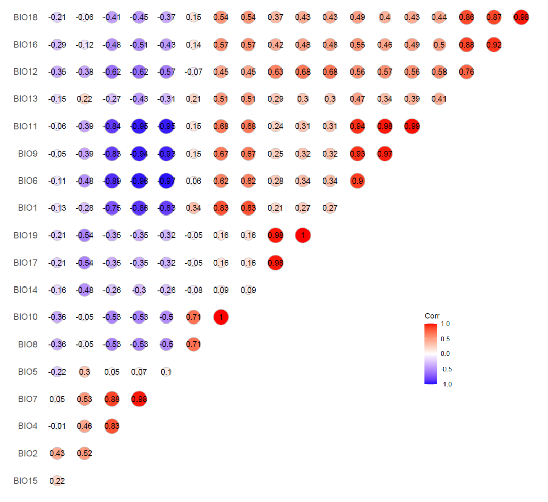
ggcorrplot作图
这个是ggplot2系列,修改细节可能会比较方便
安装install.packages("ggcorrplot")
作图代码library(ggcorrplot)
ggcorrplot(corr = corrmatrix,
hc.order = TRUE,
method = "circle",
type="upper",
lab = TRUE)+
theme(axis.text.x = element_blank(),
panel.grid = element_blank(),
legend.position = c(0.8,0.3))
 组合图
组合图library(ggcorrplot)
p1<-ggcorrplot(corr = corrmatrix,
hc.order = TRUE,
method = "circle",
type="upper",
lab = TRUE)+
theme(axis.text.x = element_blank(),
panel.grid = element_blank(),
legend.position = c(0.8,0.3))
p1
p2<-ggcorrplot(corr = corrmatrix)+
scale_fill_viridis_c()
library(patchwork)
p1+p2
示例数据和代码可以给推文打赏一元获取
欢迎大家关注我的公众号
小明的数据分析笔记本
声明:文中观点不代表本站立场。本文传送门:https://eyangzhen.com/384030.html