
1引言
之前写的 scRNAtoolVis 由很多单独的可视化函数组装起来的,并且收到了很多小伙伴的喜欢和点赞, 基本上每个函数都是属于提取数据再作图这种思路, 函数封装好以后,它的自由度便减低了,比如 Seurat的自带的函数出图大家还是想自己重新提取数据作图,不过还是会略显麻烦。
如果直接从 ggplot 里面就已经准备好了提取的数据,后面直接添加相应的图层函数,想画什么直接加不同的图层,这样岂不是更方便。 ggSCvis 就是这样工作的,很简单,就是在刚开始已经提取好了对应的数据。后面添加不同的 geom_ 图层就好了。
2安装
# install.packages("devtools")
devtools::install_github("junjunlab/ggSCvis")

# or
remotes::install_github("junjunlab/ggSCvis")
3介绍
简单 seurat 流程:
library(SeuratData)
library(Seurat)
library(ggplot2)

# AvailableData()
# InstallData("pbmc3k")

data("pbmc3k")
# pbmc <- pbmc3k.final
pbmc <- UpdateSeuratObject(object = pbmc3k)
pbmc$groups <- rep(c('stim','control'),each = 1319)

pbmc <- NormalizeData(pbmc)
pbmc <- FindVariableFeatures(pbmc, selection.method = "vst", nfeatures = 2000)
all.genes <- rownames(pbmc)
pbmc <- ScaleData(pbmc, features = all.genes)
pbmc <- RunPCA(pbmc, features = VariableFeatures(object = pbmc))
pbmc <- FindNeighbors(pbmc, dims = 1:10)
pbmc <- FindClusters(pbmc, resolution = 0.5)

pbmc <- RunTSNE(pbmc, dims = 1:10)
pbmc <- RunUMAP(pbmc, dims = 1:10)

DimPlot(pbmc, reduction = "umap")
DimPlot(pbmc, reduction = "tsne")

FeaturePlot(pbmc,
            features = c("MS4A1", "GNLY", "CD3E", "CD14", "FCER1A", "FCGR3A", "LYZ", "PPBP"),
            ncol = 4)
默认:
library(ggSCvis)
library(ggplot2)
library(grid)

p <- ggscplot(object = pbmc)
p

看看数据有哪些:
colnames(p$data)
# [1] "Dim1"               "Dim2"               "ident"              "orig.ident"
# [5] "nCount_RNA"         "nFeature_RNA"       "seurat_annotations" "RNA_snn_res.0.5"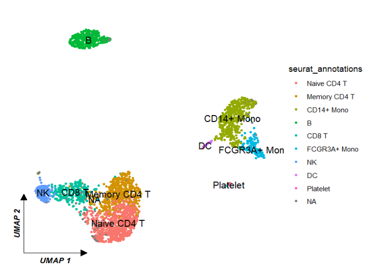
# [9] "seurat_clusters" "groups" "cell"聚类图:ggscplot(object = pbmc) +
geom_scPoint(aes(color = seurat_annotations,
cluster = seurat_annotations)) +
theme_sc(x.label = "UMAP 1",y.label = "UMAP 2")
调整标签:
ggscplot(object = pbmc) +
  geom_scPoint(aes(color = seurat_annotations,
                   cluster = seurat_annotations),
               label.gp = gpar(fontsize = 8,fontface = "bold.italic")) +
  theme_sc(x.label = "UMAP 1",y.label = "UMAP 2")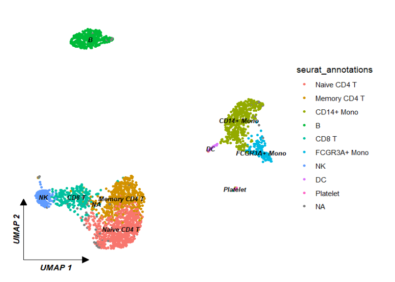
分面:
ggscplot(object = pbmc) +
  geom_scPoint(aes(color = seurat_annotations,
                   cluster = seurat_annotations),
               label.gp = gpar(fontsize = 8,fontface = "bold.italic")) +
  theme_sc(x.label = "UMAP 1",y.label = "UMAP 2") +
  facet_wrap(~groups)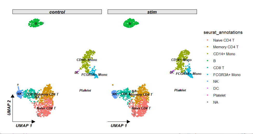
ggscplot(object = pbmc) +
  geom_scPoint(aes(color = seurat_annotations,
                   cluster = seurat_annotations),
               label.gp = gpar(fontsize = 8,fontface = "bold.italic")) +
  theme_sc(x.label = "UMAP 1",y.label = "UMAP 2") +
  facet_wrap(~groups,scales = "free")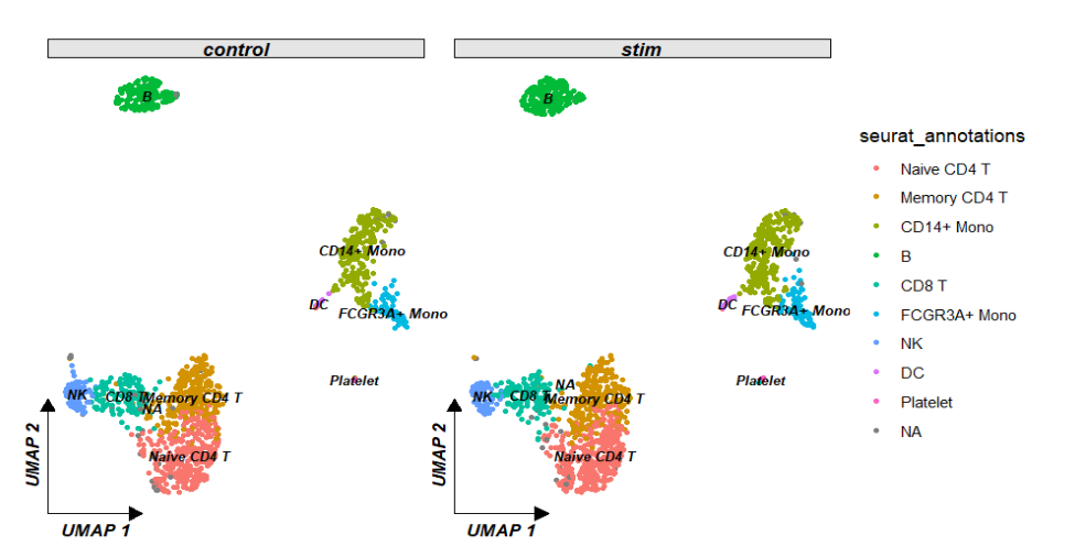
reduction 指定降维类型,默认umap:
ggscplot(object = pbmc,reduction = "tsne") +
  geom_scPoint(aes(color = seurat_annotations,
                   cluster = seurat_annotations)) +
  theme_sc(x.label = "TSNE 1",y.label = "TSNE 2")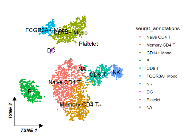
细胞数量:
ggscplot(object = pbmc) +
  geom_bar(aes(y = seurat_annotations,fill = seurat_annotations),
           inherit.aes = F,width = 0.75,show.legend = F) +
  theme_bw() +
  xlab("Cell Numbers") + ylab("")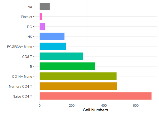
基因表达:
genes <- c("MS4A1", "GNLY", "CD3E", "CD14", "FCER1A", "FCGR3A", "LYZ", "PPBP")

ggscplot(object = pbmc,
         features = genes) +
  geom_scPoint(aes(color = value)) +
  scale_color_gradient(low = "grey90",high = "red") +
  theme_sc(x.label = "UMAP 1",y.label = "UMAP 2") +
  facet_wrap(~gene_name,ncol = 4,scales = "fixed")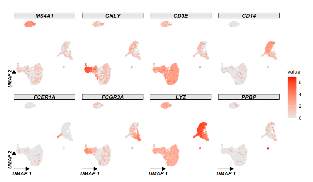
ggscplot(object = pbmc,
         features = genes) +
  geom_scPoint(aes(color = value)) +
  scale_color_gradient(low = "grey90",high = "red") +
  theme_sc(x.label = "UMAP 1",y.label = "UMAP 2") +
  facet_wrap(~gene_name,ncol = 4,scales = "free")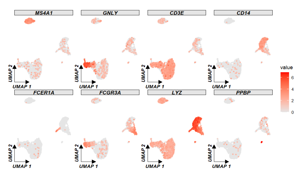
ggscplot(object = pbmc,
         features = genes) +
  geom_scPoint(aes(color = value)) +
  scale_color_gradient(low = "grey90",high = "red") +
  theme_sc(x.label = "UMAP 1",y.label = "UMAP 2") +
  facet_feature(strip.col = circlize::rand_color(8))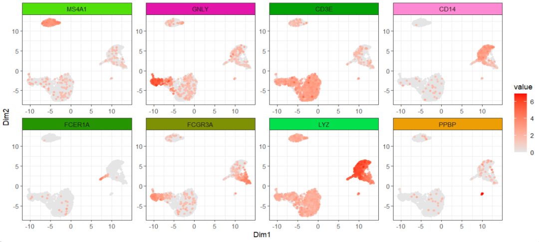
你也可以使用 geom_markArrow 对指定的 panel 添加箭头:
ggscplot(object = pbmc,
         features = genes) +
  geom_scPoint(aes(color = value)) +
  scale_color_gradient(low = "grey90",high = "red") +
  theme_sc(add.arrow = F) +
  facet_feature(strip.col = rainbow(8)) +
  theme(axis.ticks = element_blank(),
        axis.text = element_blank(),
        panel.border = element_blank()) +
  geom_markArrow(facet.vars = list(gene_name = "GNLY"),
                 rel.pos = 0,label.shift = c(0.1,0.1))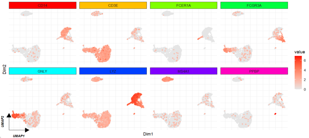
小提琴图:
ggscplot(object = pbmc,features = genes,
         mapping = aes(x = seurat_clusters,y = value)) +
  geom_violin(aes(fill = seurat_clusters)) +
  facet_feature(strip.col = circlize::rand_color(8))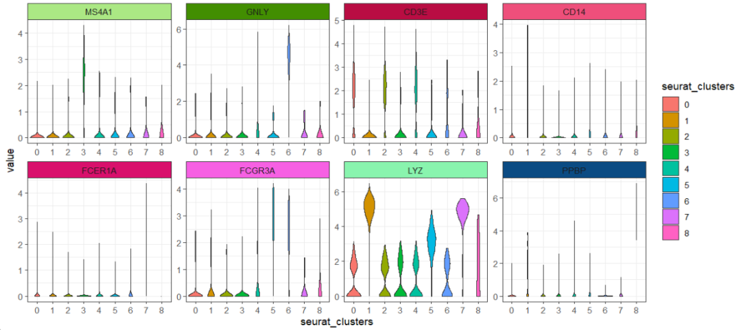
多组比较:
ggscplot(object = pbmc,features = genes[1:2],
         mapping = aes(x = seurat_clusters,y = value)) +
  geom_violin(aes(fill = groups)) +
  facet_feature(strip.col = circlize::rand_color(8))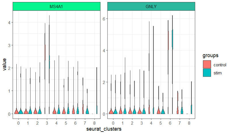
分半小提琴:
library(gghalves)

ggscplot(object = pbmc,features = genes[1:2],
         mapping = aes(x = seurat_clusters,y = value,fill = groups)) +
  geom_half_violin(data = ~ subset(.,groups %in% "control"),side = "l",draw_quantiles = 0.5) +
  geom_half_violin(data = ~ subset(.,groups %in% "stim"),side = "r",draw_quantiles = 0.5) +
  facet_feature(strip.col = circlize::rand_color(8))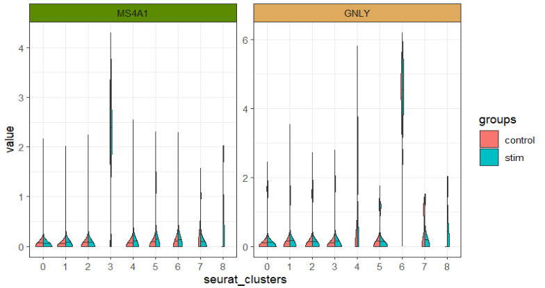
ggscplot(object = pbmc,features = genes,
         mapping = aes(x = seurat_clusters,y = value,fill = groups)) +
  geom_half_violin(data = ~ subset(.,groups %in% "control"),side = "l",draw_quantiles = 0.5) +
  geom_half_violin(data = ~ subset(.,groups %in% "stim"),side = "r",draw_quantiles = 0.5) +
  facet_hetamap(facet_row = "gene_name",strip.col = rainbow(8)) +
  scale_fill_brewer(palette = "Set2")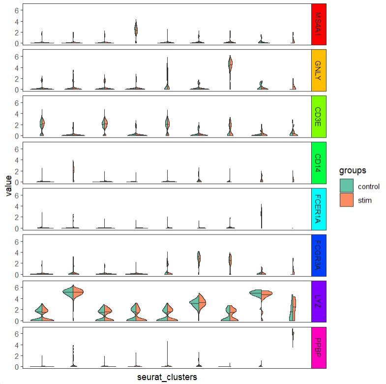
ggscplot(object = pbmc,features = genes,
         mapping = aes(x = seurat_clusters,y = value),
         slot = "counts") +
  geom_violin(aes(fill = seurat_clusters)) +
  facet_feature(strip.col = circlize::rand_color(8))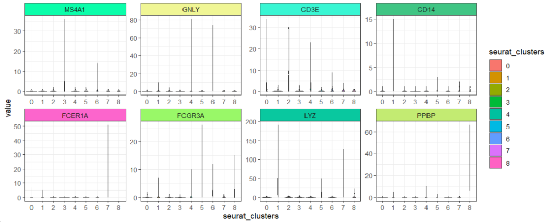
箱线图:
ggscplot(object = pbmc,features = genes,
         mapping = aes(x = seurat_clusters,y = value)) +
  geom_boxplot(aes(fill = seurat_clusters),outlier.colour = "grey90") +
  facet_feature(strip.col = circlize::rand_color(8)) +
  scale_fill_brewer(palette = "Set3")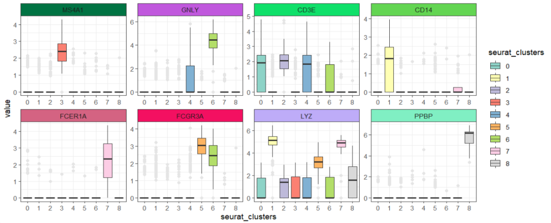
热图:
ggscplot(object = pbmc,features = genes,
         mapping = aes(x = cell,y = gene_name)) +
  geom_tile(aes(fill = value)) +
  scale_fill_gradient(low = "grey90",high = "red") +
  facet_hetamap(facet_col = "seurat_clusters",
                strip.col = circlize::rand_color(9))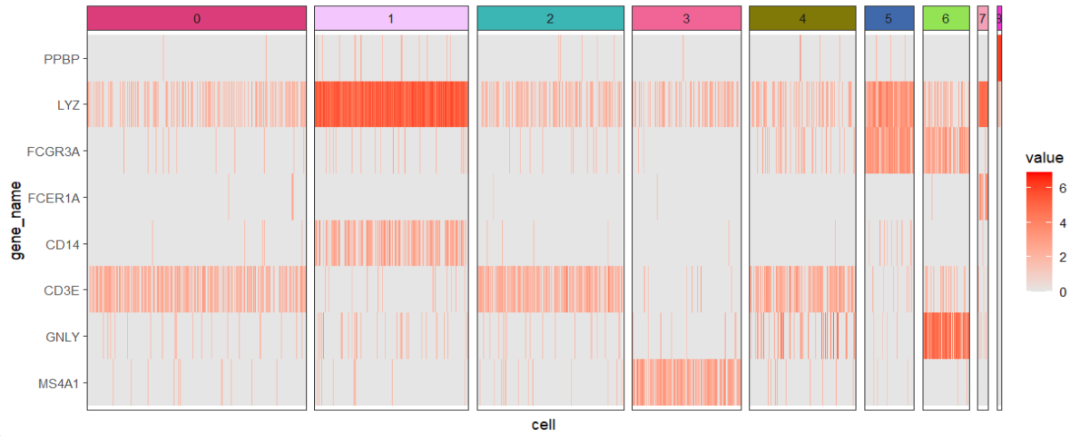
ggscplot(object = pbmc,features = genes,
         mapping = aes(x = cell,y = gene_name)) +
  geom_tile(aes(fill = value)) +
  scale_fill_gradient(low = "white",high = "red") +
  facet_hetamap(facet_col = "seurat_clusters",
                strip.col = circlize::rand_color(9),
                space = "fixed")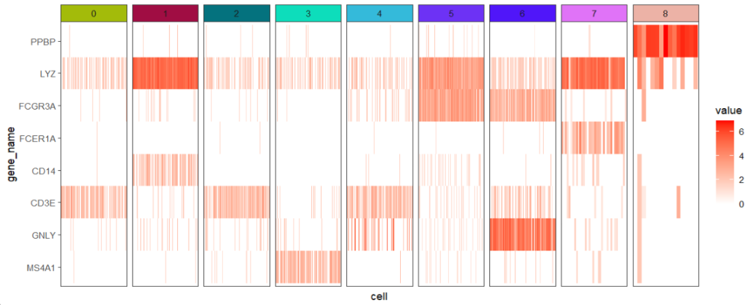
可视化 marker 基因:
pbmc.markers <- FindAllMarkers(pbmc, only.pos = TRUE)
mk <- pbmc.markers %>%
  dplyr::group_by(cluster) %>%
  dplyr::filter(avg_log2FC > 1) %>%
  dplyr::group_by(cluster) %>%
  dplyr::arrange(p_val_adj ,avg_log2FC) %>%
  dplyr::slice_head(n = 5)

# check
head(mk,3)
# # A tibble: 3 × 7
# # Groups:   cluster [1]
#       p_val avg_log2FC pct.1 pct.2 p_val_adj cluster gene
#      <dbl>      <dbl> <dbl> <dbl>     <dbl> <fct>   <chr>
# 1 3.04e-104       1.11 0.895 0.592 4.16e-100 0       LDHB
# 2 1.10e- 81       2.35 0.432 0.111 1.51e- 77 0       CCR7
# 3 4.20e- 79       1.10 0.848 0.407 5.75e- 75 0       CD3D
featuresAnno 用来给基因添加注释:
ggscplot(object = pbmc,
         features = mk$gene,
         featuresAnno = mk$cluster,
         mapping = aes(x = cell,y = gene_name)) +
  geom_tile(aes(fill = value)) +
  scale_fill_gradient(low = "grey90",high = "red") +
  facet_hetamap(facet_col = "seurat_clusters",
                facet_row = "featureAnno",
                strip.col = circlize::rand_color(9),
                space = "fixed",
                scales = "free")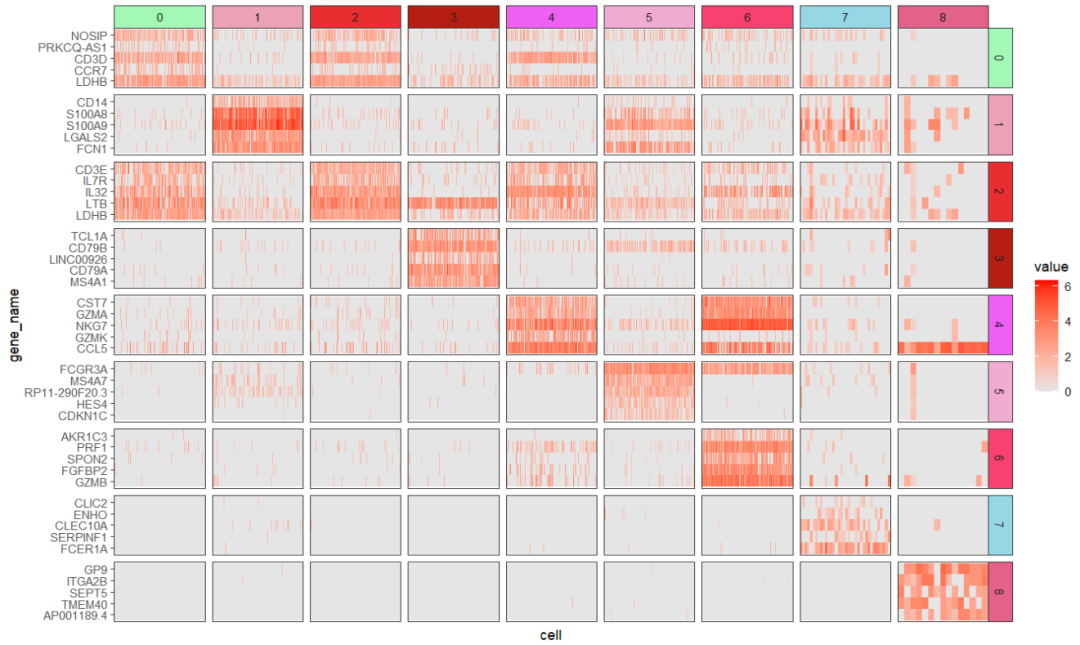
后面各种随心所欲的细节就看你自己怎么调整了。
4结尾
路漫漫其修远兮,吾将上下而求索。
欢迎加入生信交流群。加我微信我也拉你进 微信群聊 老俊俊生信交流群 (微信交流群需收取 20 元入群费用,一旦交费,拒不退还!(防止骗子和便于管理)) 。QQ 群可免费加入, 记得进群按格式修改备注哦。
声明:文中观点不代表本站立场。本文传送门:https://eyangzhen.com/387128.html