
这个链接里有很多有意思数据可视化例子,我看了一下有一部分的数据是可以下载的,我们可以用R语言试着复现一下这里的例子。
首先是我自己比较感兴趣的一个例子
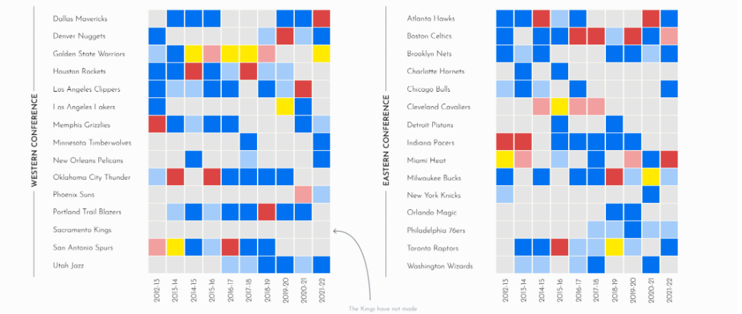

热图展示NBA12到21赛季冠军归属。数据好像只能下载西部的,今天的推文就复现左侧的图
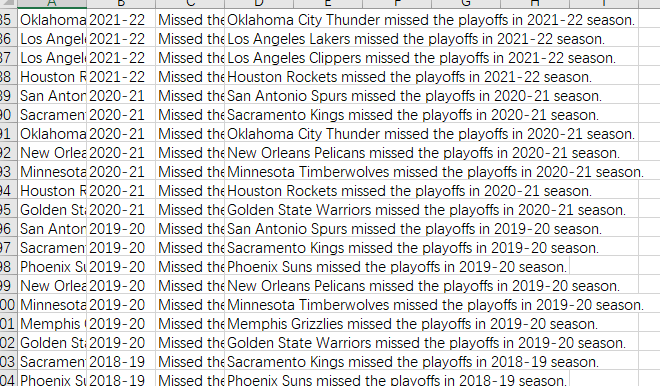
部分数据截图
读取数据
library(tidyverse)

read_csv("data/20231225/Western Conference_data.csv") %>%
  pull(`Team (group)`) %>% unique()

dat<-read_csv("data/20231225/Western Conference_data.csv")
head(dat)

table(dat$`Best Achievement`)
热图代码
p1<-ggplot(data=dat,aes(x=`Team (group)`,y=Year))+
  geom_tile(aes(fill=`Best Achievement`),
            color="white")+
  scale_fill_manual(values = c("Missed the Playoffs"="#e5e5e5",
                               "Runner-Up"="#f1a09f",
                               "Western Conference Semifinals"="#a3ccfa",
                               "Western Conference Finals"="#dc4443",
                               "Western Conference First Round"="#0071f1",
                               "Winner"="#ffea00"),
                    labels=c("Missed the Playoffs",
                             "Runner-Up",
                             "Western Conference Semifinals"="Conference Semifinal",
                             "Western Conference Finals"="Conference Finals",
                             "Western Conference First Round"="First Round",
                             "Winner"="Champion"))+
  theme_bw(base_size = 15)+
  theme(panel.grid = element_blank(),
        panel.border = element_blank(),
        axis.ticks = element_blank(),
        axis.text.x = element_text(angle = 30,hjust=1,vjust=1),
        legend.position = "top")+
  labs(x=NULL,y=NULL)+
  guides(fill=guide_legend(nrow = 2,
                           title.position = "top",
                           title.hjust = 0.5))+
  coord_equal()
p1
文本注释
p2<-ggplot()+
  geom_textsegment(aes(y=1,yend=1,x=15,xend=1),
                   label="Western Conference",
                   size=10,color="gray")+
  theme_void()
p2
两个图组合到一起
library(patchwork)

p1/p2+
  plot_layout(heights= c(10,1))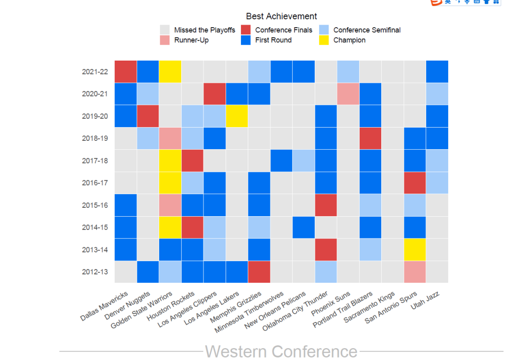
从热图上可以看出10个赛季中西部球队拿了6个冠军。勇士拿了其中的四个,另外两个球队是湖人和马刺。国王连续10个赛季没有进季后赛
声明:文中观点不代表本站立场。本文传送门:https://eyangzhen.com/388449.html