
1引言
简单的把 smartLabelAlignGrob 封装为 geom 图层 geom_marklabel,这样用 ggplot 绘制热图添加部分特定标签方便些。下面画单细胞热图来举例。
2安装
# install.packages("devtools")
devtools::install_github("junjunlab/ggSCvis")

# or
remotes::install_github("junjunlab/ggSCvis")
3示例
加载包和准备数据:
library(ggSCvis)
library(ggplot2)
library(SeuratData)
library(Seurat)
library(tidyverse)


data("pbmc3k")
pbmc <- pbmc3k.final
pbmc <- UpdateSeuratObject(object = pbmc)

pbmc.markers <- FindAllMarkers(pbmc, only.pos = TRUE)
mk <- pbmc.markers %>%
  dplyr::group_by(cluster) %>%
  dplyr::filter(avg_log2FC > 1) %>%
  dplyr::group_by(cluster) %>%
  dplyr::arrange(p_val_adj ,avg_log2FC) %>%
  dplyr::slice_head(n = 10)

mark_gene <- sample(mk$gene,20,replace = F)
按亚群分面:
ggscplot(object = pbmc,
         features = mk$gene,
         mapping = aes(x = cell,y = gene_name)) +
  geom_tile(aes(fill = value)) +
  scale_fill_gradient(low = "grey90",high = "red") +
  facet_wrap(~seurat_clusters,nrow = 1,scales = "free_x") +
  # mark for last panel
  geom_marklabel(data = . %>% dplyr::filter(seurat_clusters == "8"),
                 mark.label = mark_gene) +
  theme(axis.text.x = element_blank(),
        axis.ticks.x = element_blank(),
        legend.position = "left",
        plot.margin = margin(r = 0.15,unit = "npc"))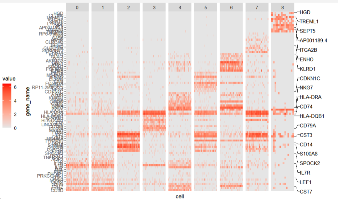

use.smartAlign2 = T:
ggscplot(object = pbmc,
         features = mk$gene,
         mapping = aes(x = cell,y = gene_name)) +
  geom_tile(aes(fill = value)) +
  scale_fill_gradient(low = "grey90",high = "red") +
  facet_wrap(~seurat_clusters,nrow = 1,scales = "free_x") +
  theme(axis.text.x = element_blank(),
        axis.ticks.x = element_blank(),
        legend.position = "left",
        plot.margin = margin(r = 0.1,unit = "npc")) +
  geom_marklabel(data = . %>% filter(seurat_clusters == "8"),
                 mark.label = mark_gene,
                 use.smartAlign2 = T)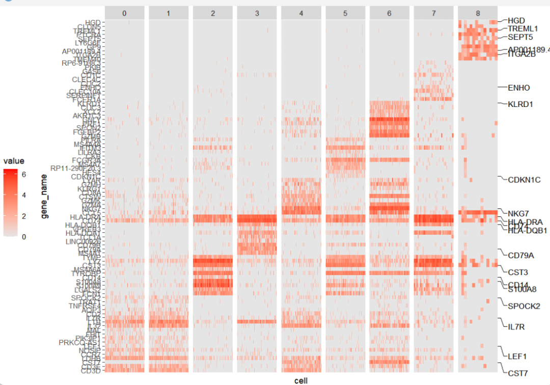
调整位置:
ggscplot(object = pbmc,
         features = mk$gene,
         mapping = aes(x = cell,y = gene_name)) +
  geom_tile(aes(fill = value)) +
  scale_fill_gradient(low = "grey90",high = "red") +
  facet_wrap(~seurat_clusters,nrow = 1,scales = "free_x") +
  scale_y_discrete(position = "right") +
  geom_marklabel(data = . %>% filter(seurat_clusters == "0"),
                 mark.label = mark_gene,
                 pos = "left") +
  theme(axis.text.x = element_blank(),
        axis.ticks.x = element_blank(),
        legend.position = "right",
        plot.margin = margin(l = 0.15,unit = "npc"))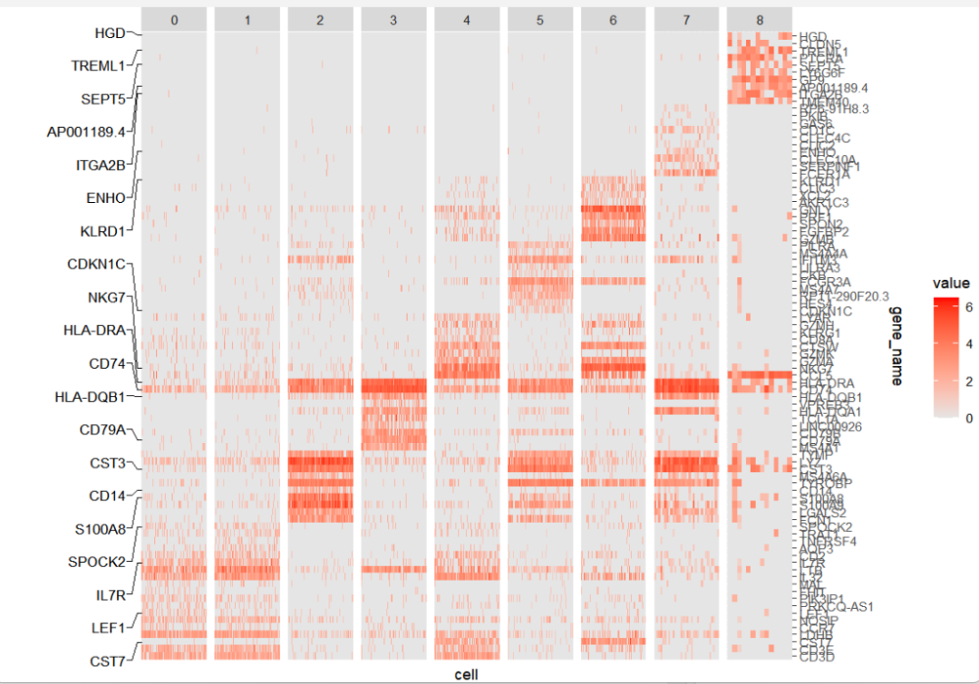
横过来标注:
ggscplot(object = pbmc,
         features = mk$gene,
         mapping = aes(y = cell,x = gene_name)) +
  geom_tile(aes(fill = value)) +
  scale_fill_gradient(low = "grey90",high = "red") +
  scale_x_discrete(position = "top") +
  facet_wrap(~seurat_clusters,ncol = 1,scales = "free_y",switch = "y") +
  geom_marklabel(data = . %>% filter(seurat_clusters == "8"),
                 mark.label = mark_gene,
                 link.line.length = 0.1,
                 pos = "bottom") +
  theme(axis.text.y = element_blank(),
        axis.ticks.y = element_blank(),
        axis.text.x = element_text(angle = 90,hjust = 0),
        plot.margin = margin(b = 0.2,unit = "npc"))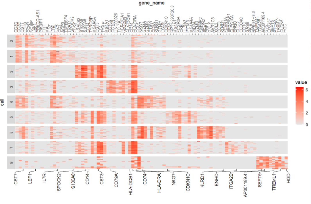
你也可以画取均值的热图:
ggscplot(object = pbmc,features = mk$gene,
         mapping = aes(y = gene_name,x = seurat_clusters,
                       fill = mean_exp,exp = mean_exp)) +
  geom_scTile() +
  scale_fill_gradient(low = "grey90",high = "red") +
  geom_marklabel(mark.label = mark_gene,
                 link.line.length = 0.01,
                 use.smartAlign2 = F) +
  theme_bw() +
  theme(plot.margin = margin(t = 0.05,r = 0.18,unit = "npc"),
        legend.position = "left")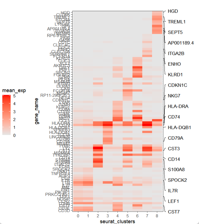
没问题你就可以把原来的基因去掉了:
mk <- pbmc.markers %>%
  dplyr::group_by(cluster) %>%
  dplyr::filter(avg_log2FC > 1) %>%
  dplyr::group_by(cluster) %>%
  dplyr::arrange(p_val_adj ,avg_log2FC) %>%
  dplyr::slice_head(n = 50)

mark_gene <- sample(mk$gene,100,replace = F)

ggscplot(object = pbmc,features = mk$gene,
         featuresAnno = mk$cluster,
         mapping = aes(y = gene_name,x = seurat_clusters,
                       fill = mean_exp,exp = mean_exp)) +
  geom_scTile() +
  scale_fill_gradient(low = "grey90",high = "red") +
  facet_wrap(~featureAnno,scales = "free",nrow = 2) +
  geom_marklabel(mark.label = mark_gene,
                 link.line.length = 0.075,
                 use.smartAlign2 = F) +
  theme_bw() +
  theme(plot.margin = margin(t = 0.1,r = 0.15,unit = "npc"),
        panel.spacing.x = unit(0.06,"npc"),
        axis.text.y = element_blank(),
        axis.ticks.y = element_blank(),
        legend.position = "left")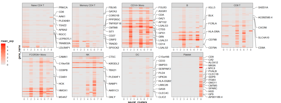
还有一些其它设置颜色,形状等的参数你可以自己看文档进行调整。
4结尾
路漫漫其修远兮,吾将上下而求索。
欢迎加入生信交流群。加我微信我也拉你进 微信群聊 老俊俊生信交流群 (微信交流群需收取 20 元入群费用,一旦交费,拒不退还!(防止骗子和便于管理)) 。QQ 群可免费加入, 记得进群按格式修改备注哦。
声明:文中观点不代表本站立场。本文传送门:https://eyangzhen.com/389369.html