
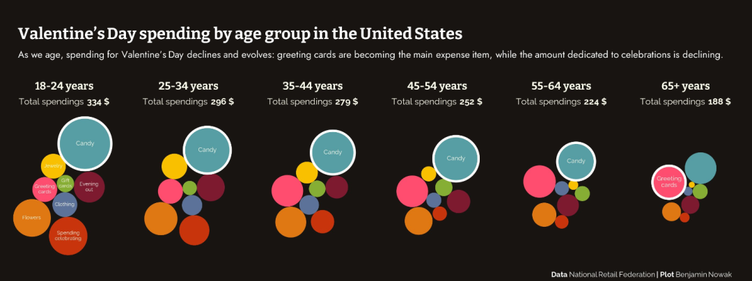
这个圆堆图(circle packing chart)之前有人问过,但是当时也不知道是如何实现的。今天看到一个很有意思的数据可视化案例:画圆堆图展示美国不同年龄段在情人节送的礼物的不同

数据和代码链接 https://github.com/BjnNowak/TidyTuesday/blob/main/valentine_day.R
这部分代码看的还不是很明白,这里画这个图是用 packcircles + ggplot2来做的,查了一下这个R包的基础用法,链接 https://r-graph-gallery.com/305-basic-circle-packing-with-one-level.html
先来画一个最基本的
这里我们只画18-24年龄段的这个图
读取数据
library(tidyverse)

read_csv("gifts_age.csv") %>%
  filter(Age=="18-24") %>%
  pivot_longer(!Age) -> dat
生成所有圆的圆心和半径的数据
library(packcircles)
packing <- circleProgressiveLayout(dat$value, sizetype='area')
packing

dat <- cbind(dat, packing)

dat
作图代码
tst <- MoMAColors::moma.colors("Klein", n=10, type="discrete")
tst

library(ggforce)
dat
ggplot()+
  geom_circle(data = dat, aes(x0=x, y0=y,r=radius, fill = name))+
  geom_text(data = dat, aes(x, y, label = name),size=5)+
  theme_void() +
  theme(legend.position="none") +
  coord_equal() -> p1

ggplot()+
  geom_circle(data = dat, aes(x0=x, y0=y,r=radius, fill = name))+
  geom_text(data = dat, aes(x, y, label = name),size=5)+
  theme_void() +
  theme(legend.position="none") +
  coord_equal()+
  scale_fill_manual(values = tst) -> p2

library(patchwork)

p1+p2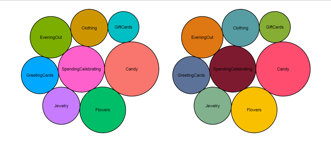
这个应该如何调整布局暂时还没有想明白,比如能不能把最大的圆放到中间的位置
这个形式在科研作图中应该可以用来替换柱形图
声明:文中观点不代表本站立场。本文传送门:https://eyangzhen.com/412000.html